Raid on Plaza Piazza
Summary: You are an agent of the local gun store chain known as The Guncase. Your goal is simple: perform a raid on the Plaza Piazza, a heavily guarded section of the mall, and secure as many guns as possible, with a powerful weapon waiting at the end.
Role: Level Designer
Project: Classwork
Team: Solo Work
Development Time: Late September 2025 – October 2025
Made Using: Unreal Engine For Fortnite
This was my second major project in Unreal Engine for Fortnite, focusing on PVE encounter design. This is also a level based on my work in my worldbuilding class, where I created a world that was a living mall.
Lessons Learned:
Measure Twice, Cut Once: Before starting a level, test how long it takes to get from one point to another. It’ll be important to gauge the correct size for a level and impact its flow!
Reframing design ideas: Sometimes the problem isn’t the idea but rather the scenario it's in. By reframing the idea in a new space, it can suddenly become much more impactful!
Combat Arena Design: A good combat arena can challenge players through the environment and give them ways to feel good about their spatial awareness by placing strategic cover or advantage points!
Shooter Encounter Design: A good encounter in a shooter game requires keen awareness of two key things. Firepower, how much gun power does the enemy have? And body count, how many enemies there are in one place for the enemy to deal with. Pair this with levels that take advantage of the enemies in the area and the strengths and weaknesses of their weapons, and you’ll have a really engaging level!
Building First Version:
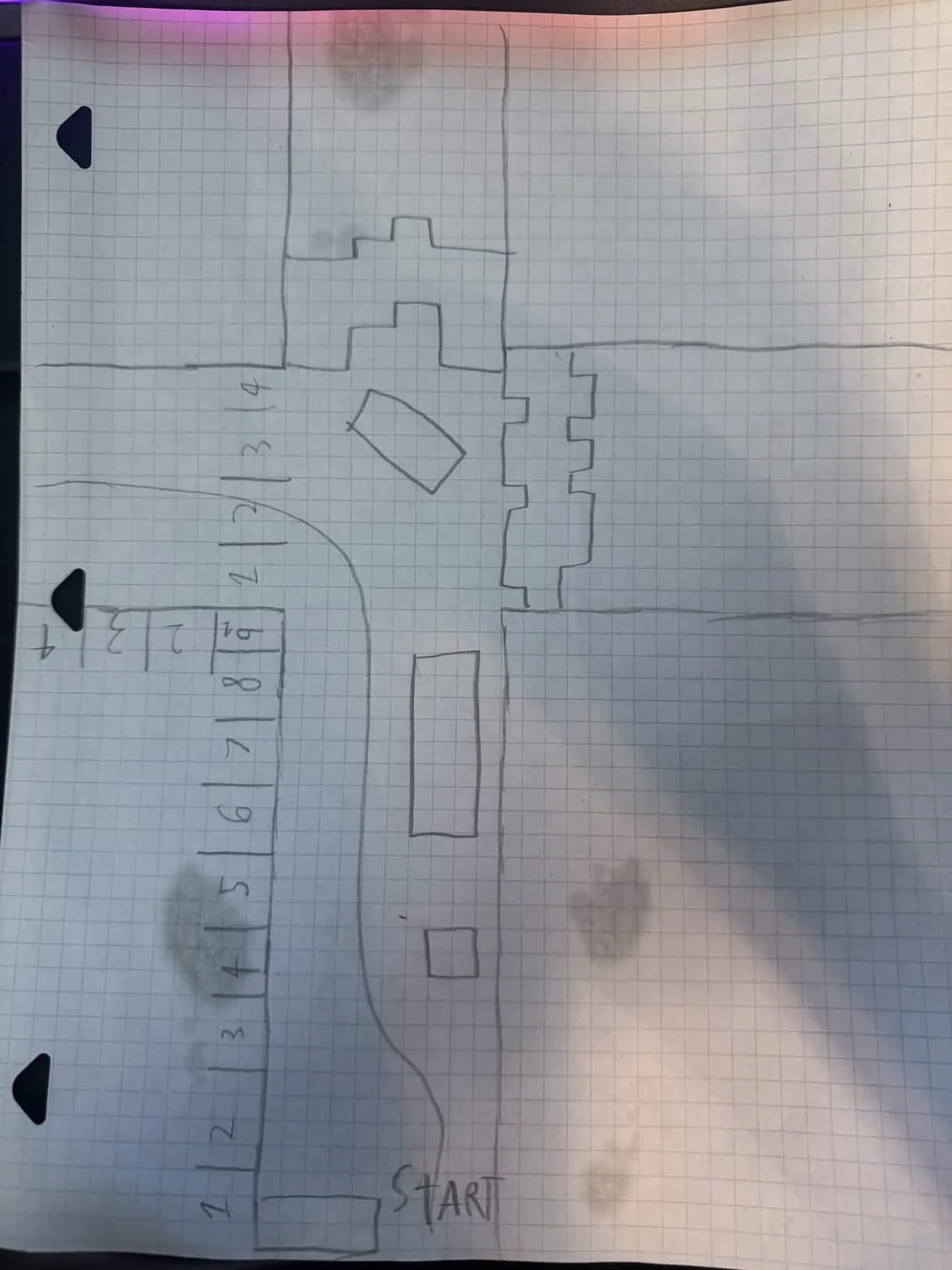
This was the first completed sketch of the level. Once I settled into making this about my living mall world, I drafted the idea of a park in the middle of a plaza. It would be a fun way to practice both nature-level design and large interior design.
I blocked out the path the player takes and where each encounter will be, indicated by the large E’s scattered across the page.
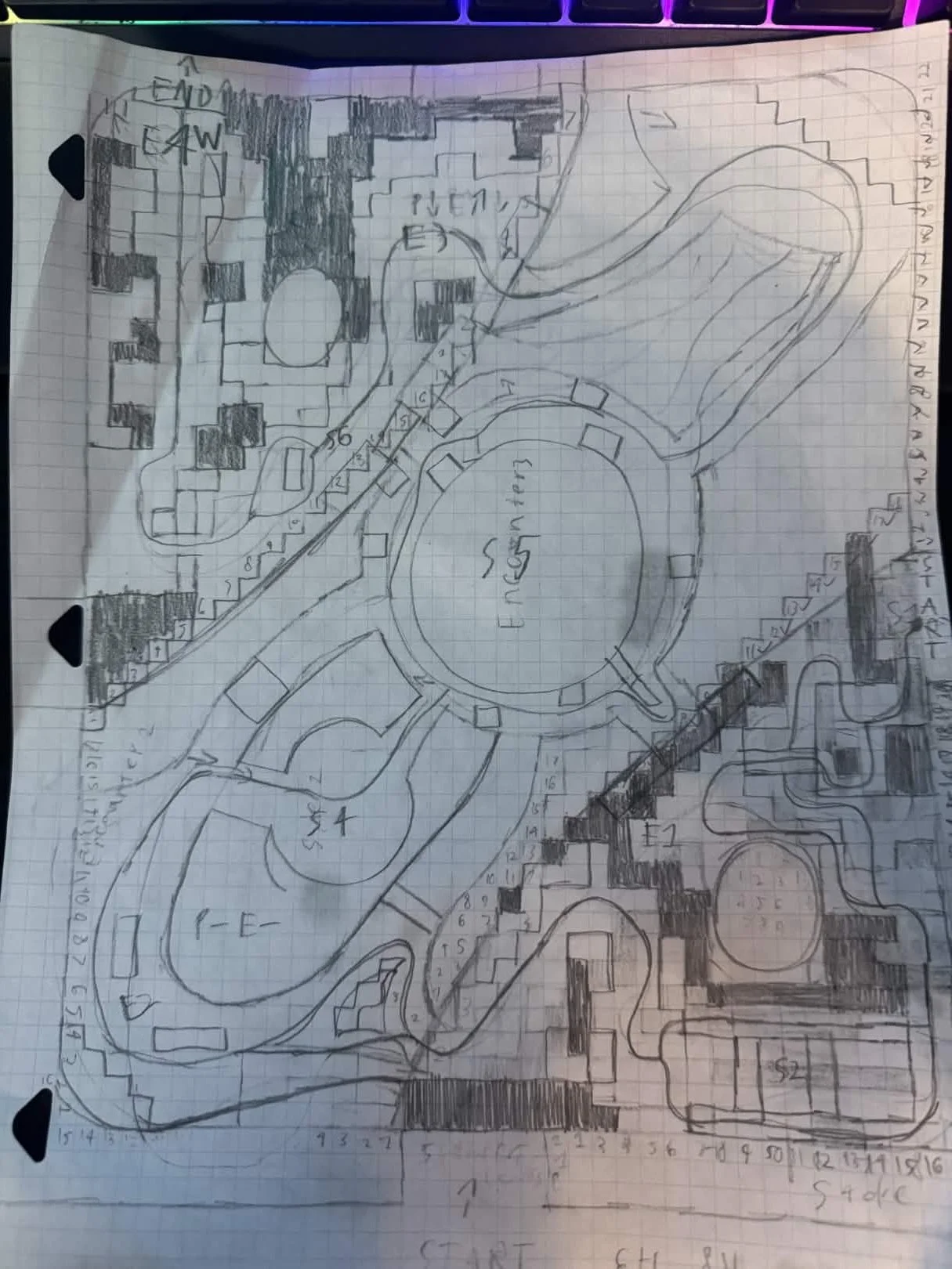
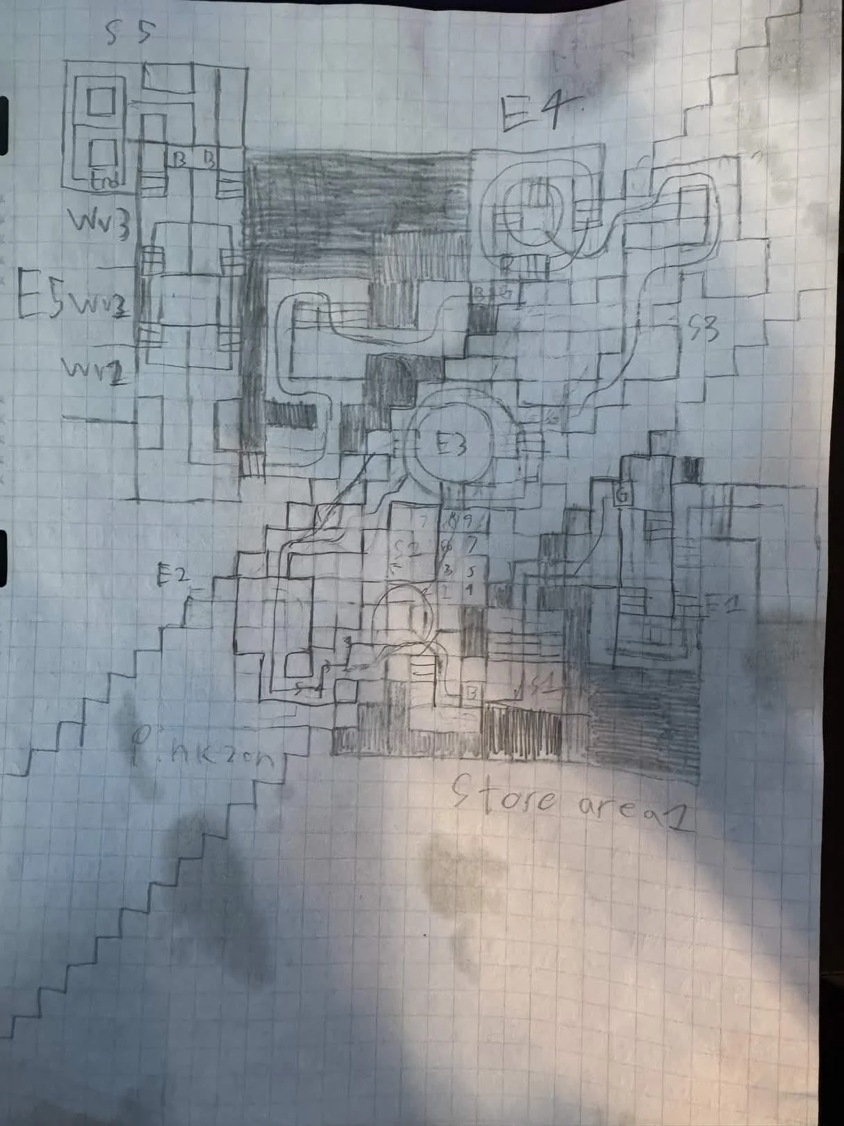
The sketch I created was so large that I had to split the final section of the level into a separate sketch.
This section is meant to represent the store you go inside at the end of the level, meant to be the enemy headquarters.
This was meant to be a bit more freeform, allowing the player ample cover in various sections that would make sense for a store, such as aisles and booths.
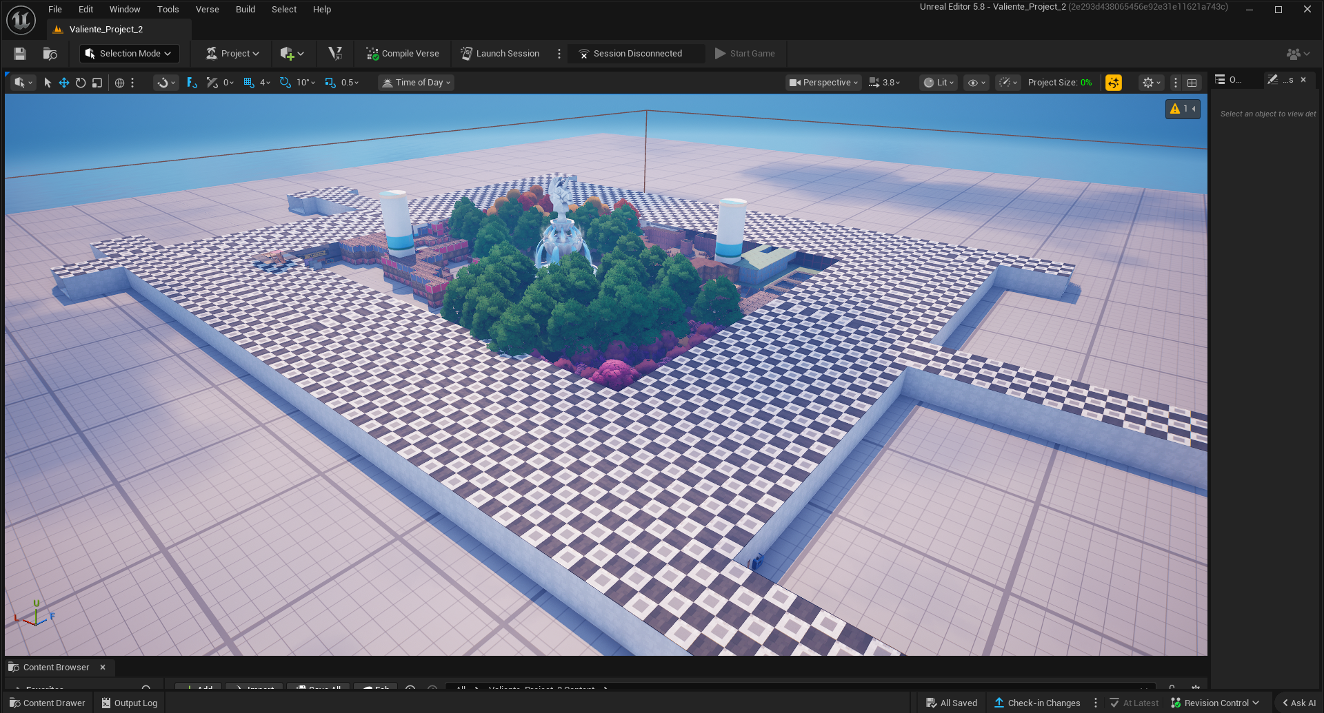
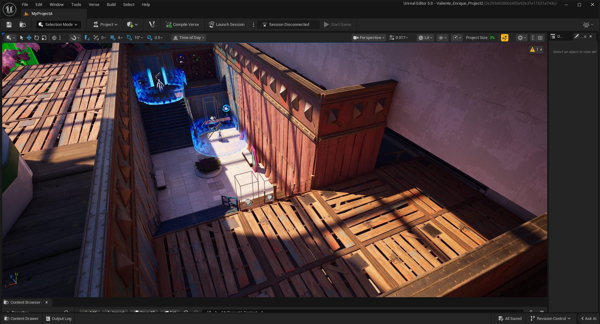
This is an overhead view of the old version of this level. The black and white checkerboard is meant to be the interior of the mall.
Since the level is focused mostly on the interior, I chose a simple grid island rather than the traditional one for greater control over my environment.
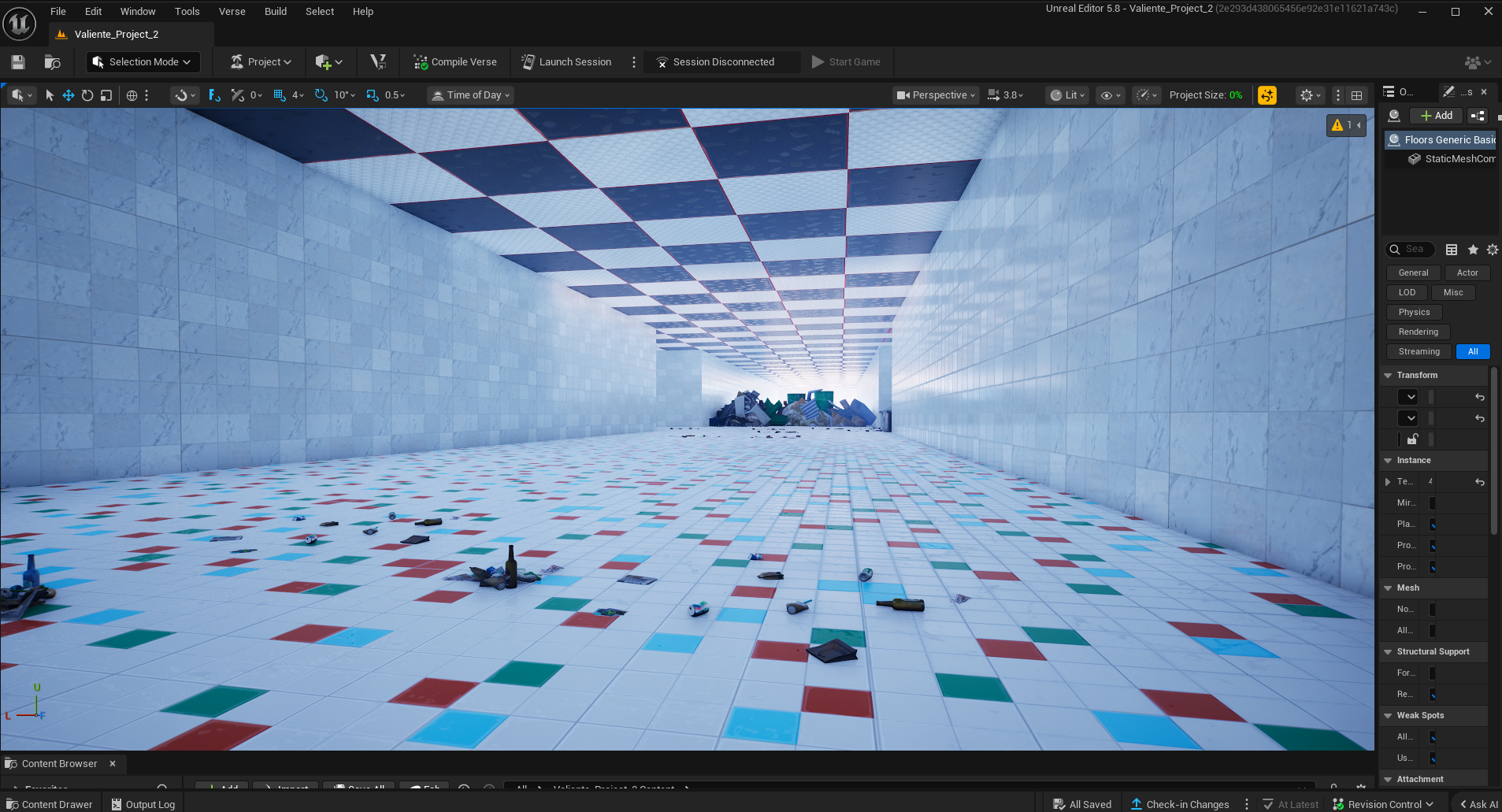
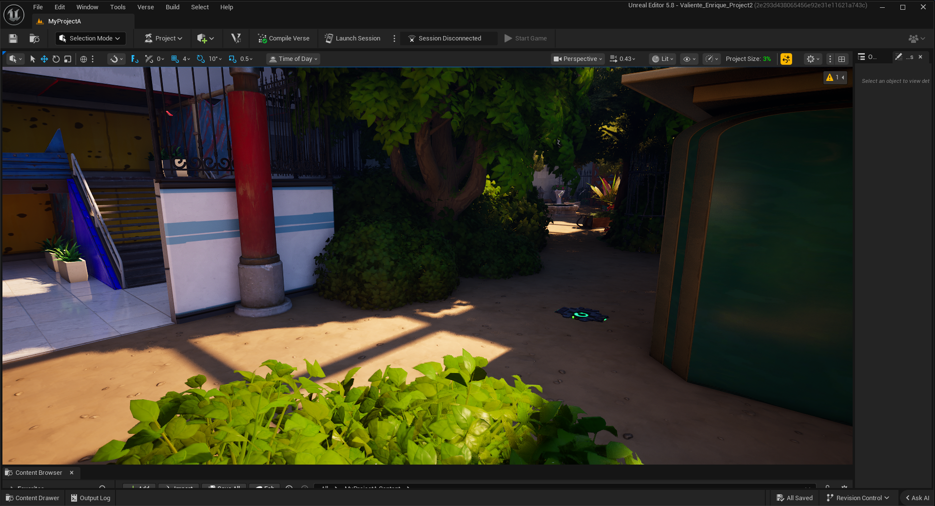
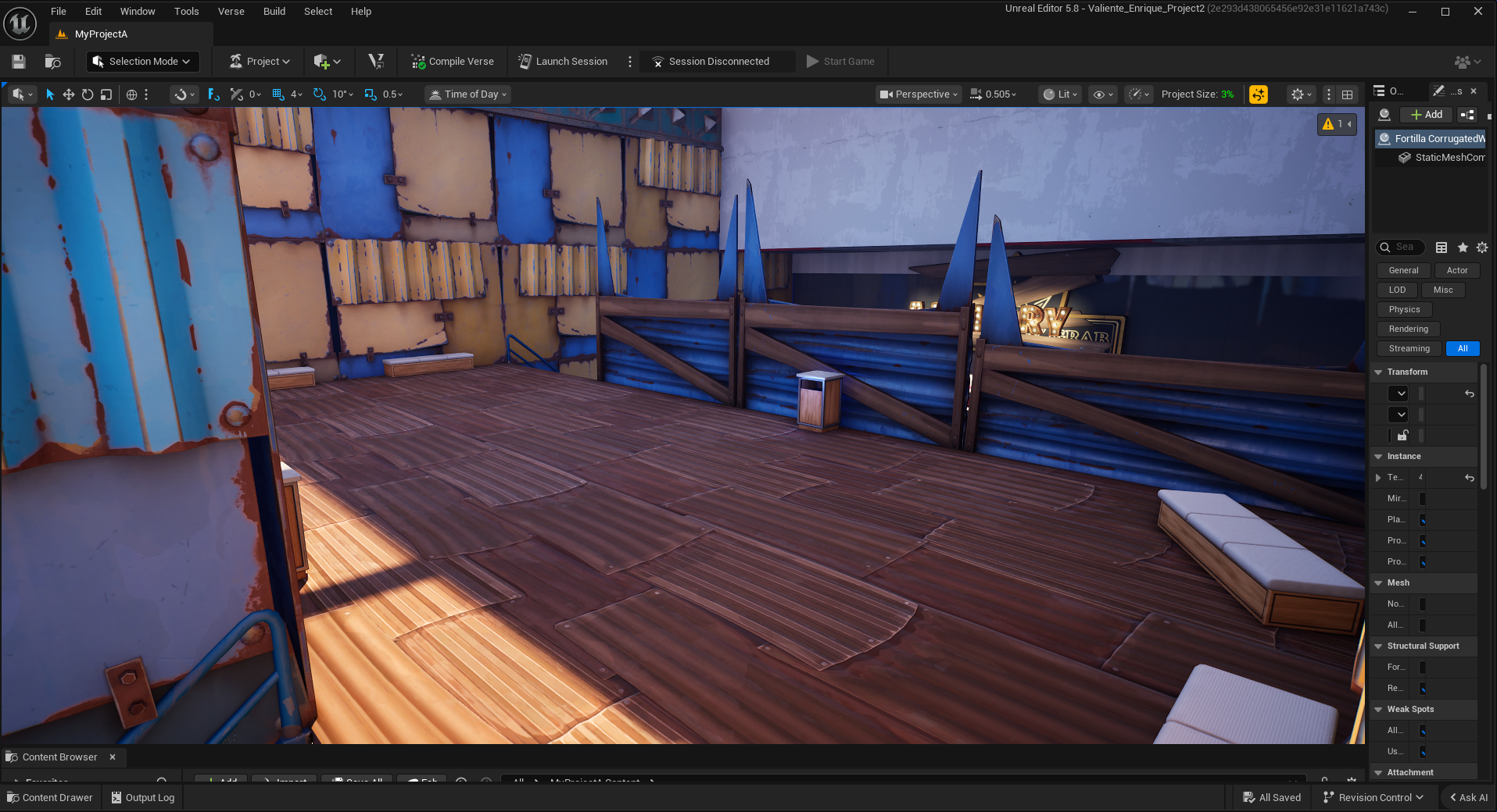
This is the starting hallway. The original plan for the hallway was that it would eventually be filled with various stores in a later revision of the level.
The trash heap at the end is intended to be artificial by the enemy organization, which is why I decided to litter the ground with trash to add some diegetic flavor to the opening and guide the player.
This is the first encounter of the level, intended as a quick way for the player to get their bearings with the controls. You may already be able to see the problems with this level's version in this shot.
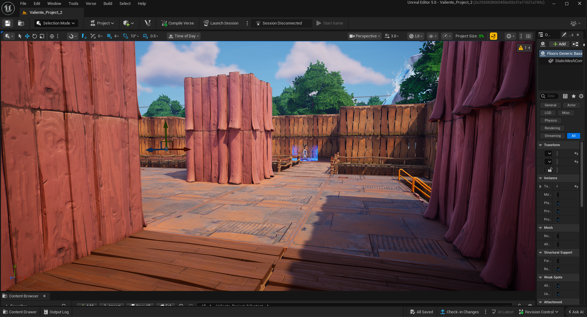
This is the entrance to the first major encounter of the level. This is intended to be the player attacking a lower-guarded back entrance to the level, which is why the poorly made staircase is here.
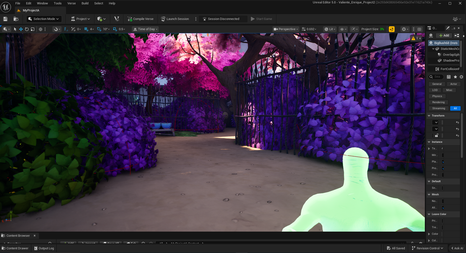
This is the entrance to the first encounter of the level. This area is meant to be the player's first major combat section. I designed this opening to give the player some breathing room before they get spotted.
Once the player is spotted, they now have 3 pathways they can take, allowing for player choice in how to approach the combat scenario

This was the only populated combat encounter in this version of the level due to a fatal problem with this level. It’s too darn big.
After building this section, I calculated the amount of time it would take the player to get from one end to the other of this level, and it was over a minute, which is a gigantic no-no when creating combat arenas.
This first encounter was also meant to flow like its own level, with an upper and a lower section that fed into each other.
I would later repurpose this upper-section, lower-section design concept into my multiplayer combat design level.
This portion is right after the first encounter and is designed to serve as a transition combat space until the next encounter.
This was intended to be an easier encounter, with all enemies at the bottom of the level, where the player can flank and get cover from the railings.
This is the final section of the first major area of the level, featuring two slightly stronger enemies with a variety of approaches, challenging the player's spatial awareness.
The gate at the end is intended to mark the park entrance, demarcating the end of the first section and the beginning of the next, with a different aesthetic from the previous one.
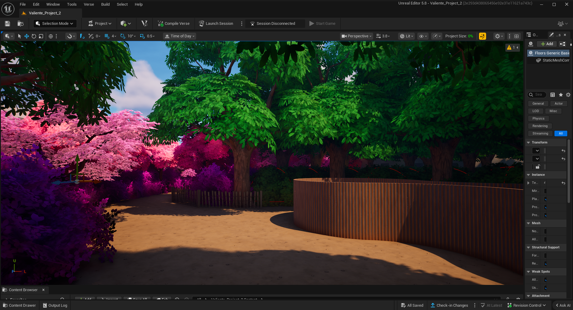
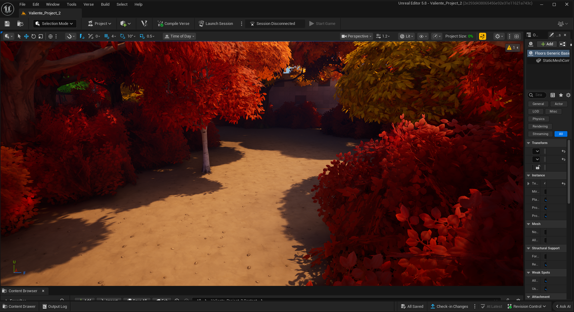
This is the opening to the park section of the level. The park itself is divided into three major sections: Spring, Summer, and Fall. Each of these sections is color-coded; this first area is spring.
I researched how national parks create their own signage and outposts to create this mitosis-looking room in the corner, the idea being that it would be where park guests could refresh and access information.
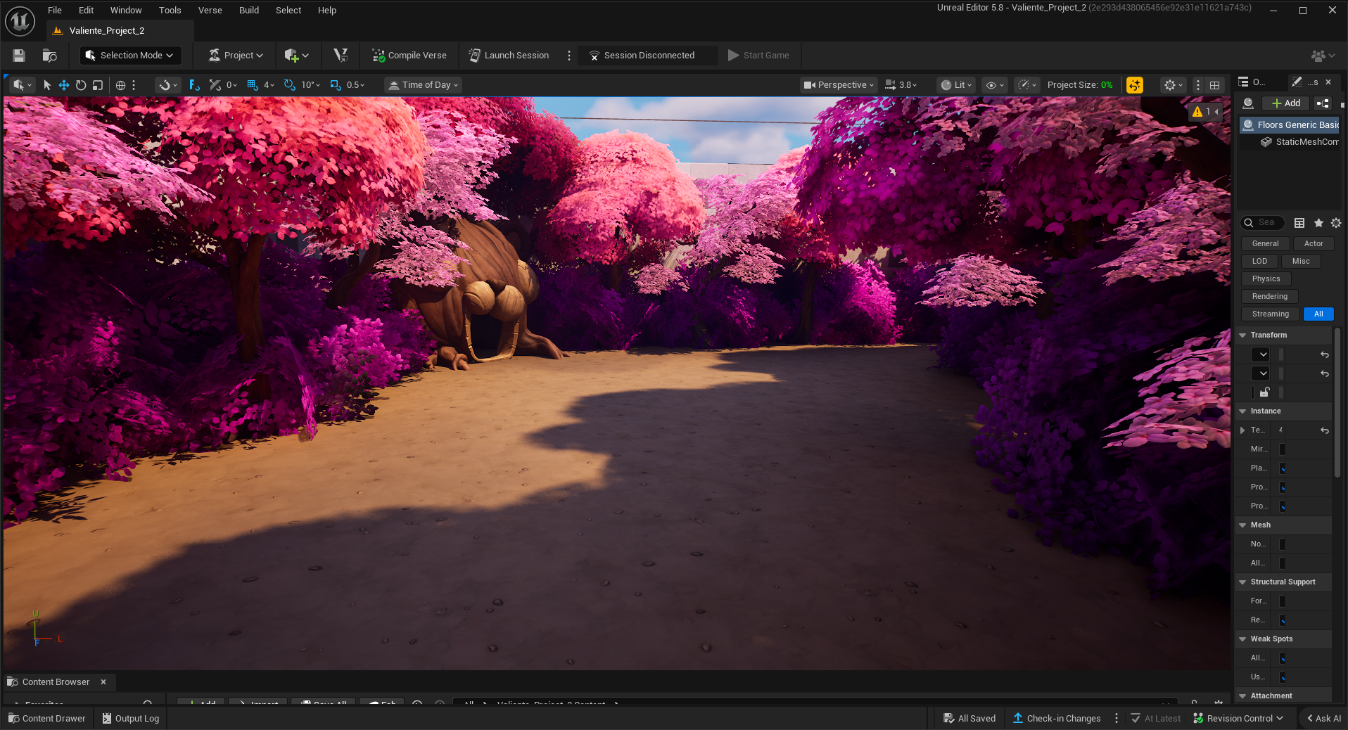
This is the spring section of the park, noted for its intense pink trees reminiscent of Sakura trees. The idea of making this section pink came about from wanting to use the cuddle team tree for the level, thinking it would be a good set pieces for a combat encounter.
This section is also intended to be a no-holds barred firefight between you and the enemy. however due to scrapping this version most of the cover was not placed.
Here is the path the player takes after the combat encounter. The idea originally was for the player to see that the gate to the main path (the left) would be closed due to the enemy faction, forcing the player to sneak through a campground.
I think this section suffers from the level's original size. The campground is too large to be hidden, so it looks like the intended path rather than a poorly disguised secret path.
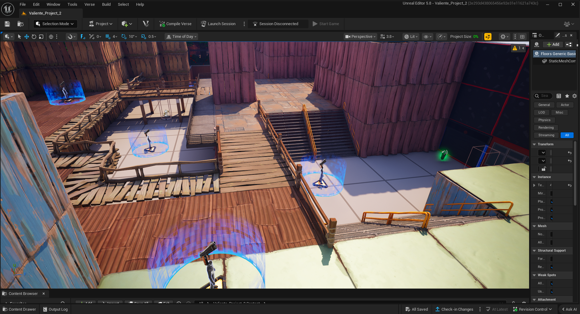
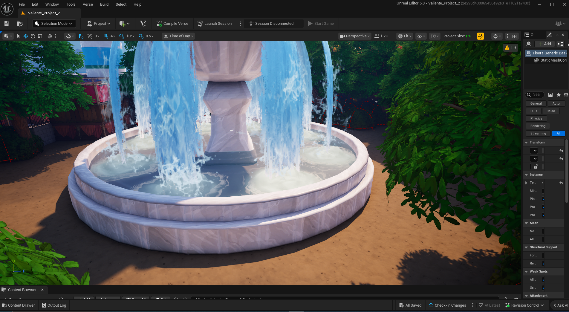
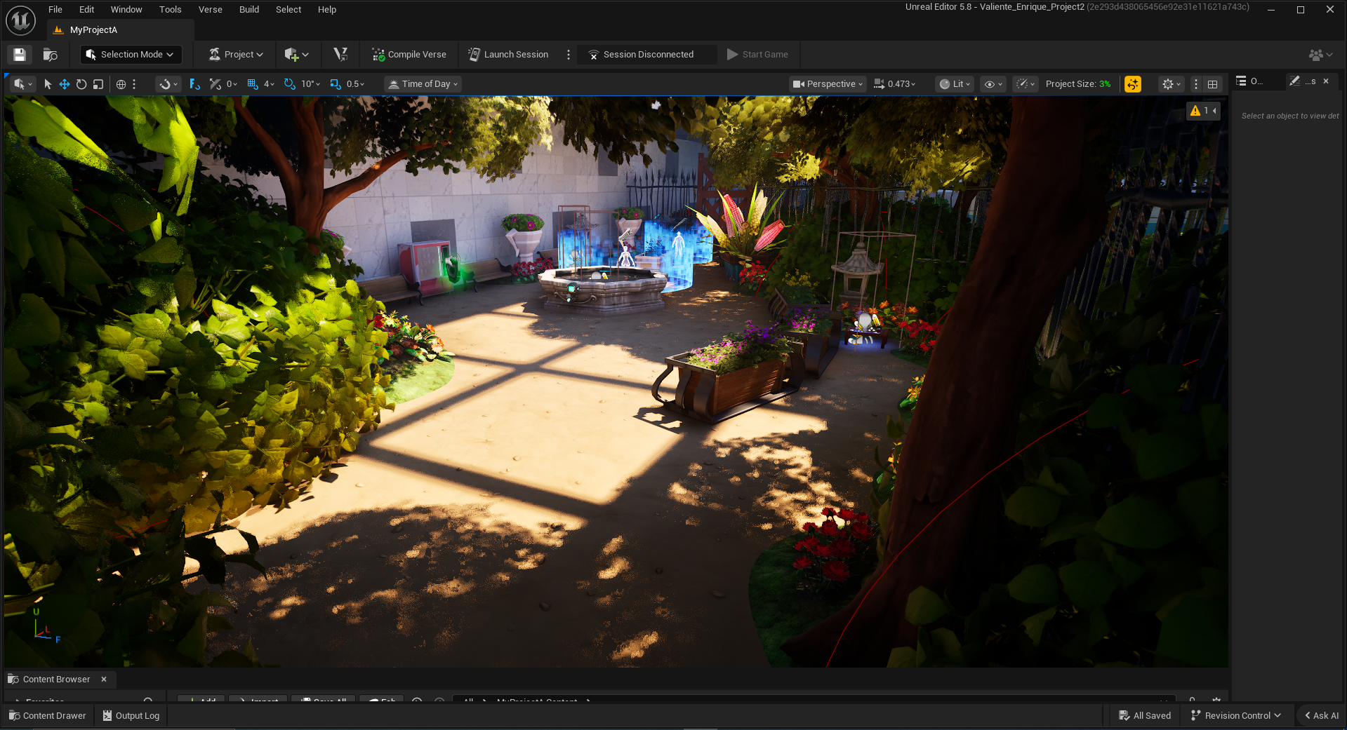
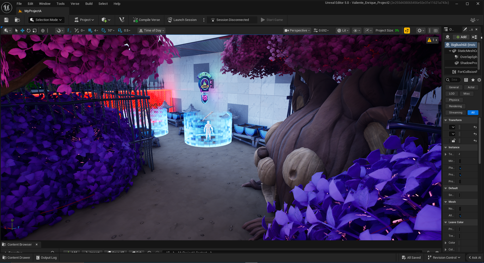
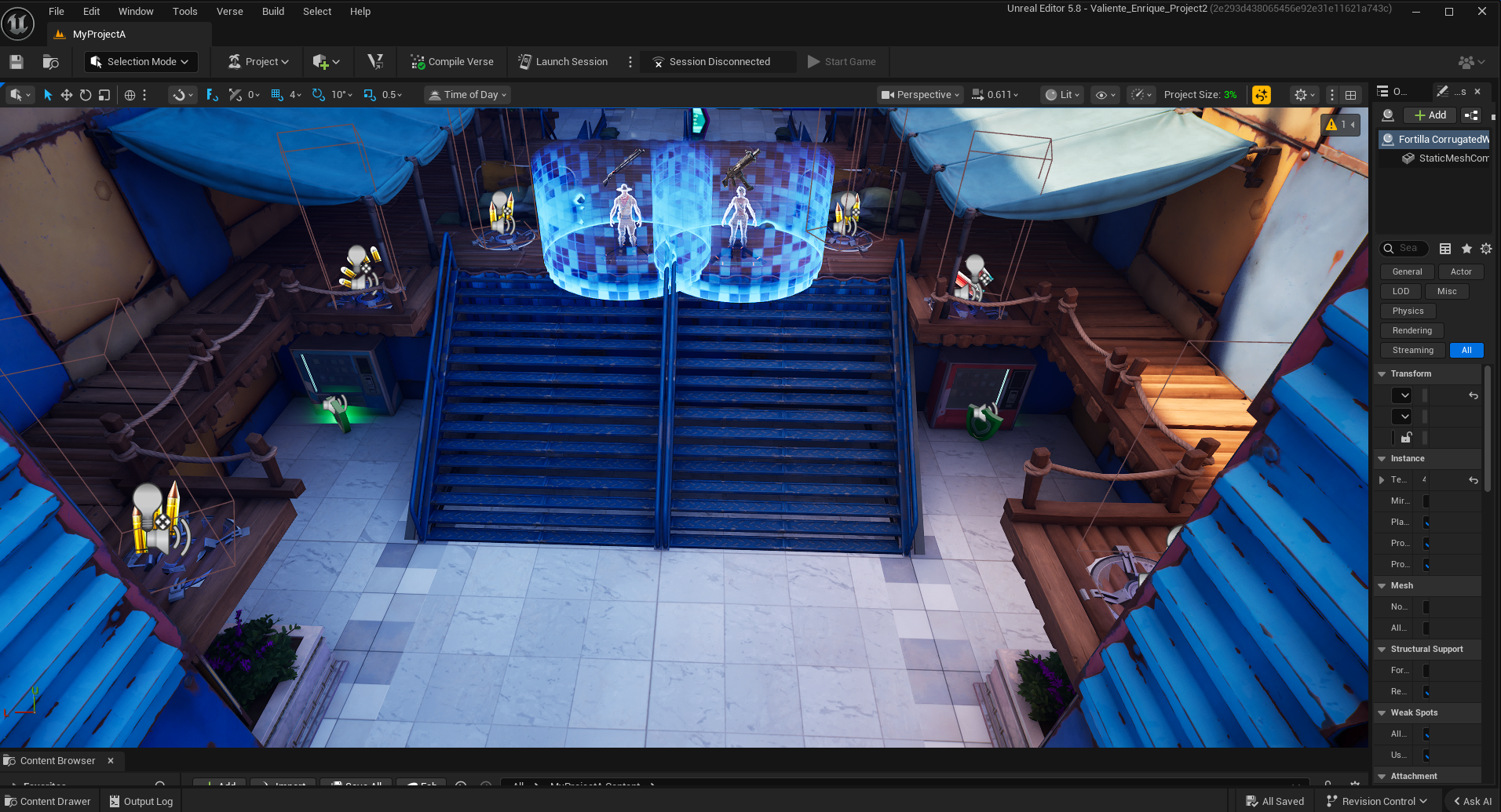
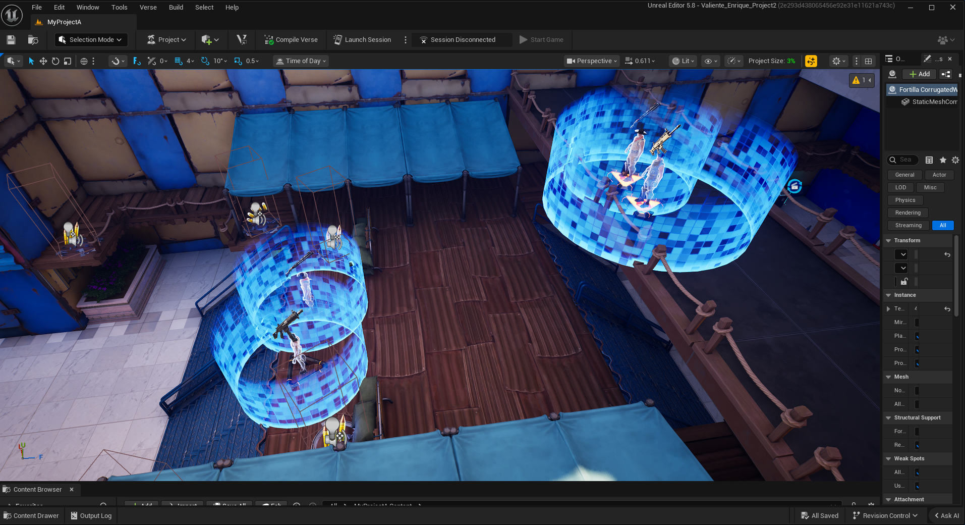
This would have been the glamour shot of the level—the fountain combat encounter. The original intention of this combat encounter was that the enemy faction would have set up two distinct buildings in this area, with the player having to make a full loop around the fountain to incapacitate each enemy.
This is where the size problem really starts to show. The fountain itself is about 16 square feet, which means it was already the size of a large building. This would have made the combat encounter last nearly three times as long as it does in the final version, which would have been incredibly poor pacing.
This is the fall section of the park, intended to be the area of a transitional combat encounter between the park section and the final mall section of the level.
This is where more aggressive enemies would have been introduced, along with slightly more hidden pick-ups. This, however, also demarcates where the cancellation of the level becomes more apparent.
This is the 4th major combat encounter arena of the level. The idea being that in this section, the enemy faction has ambushed you, and you must face them in disadvantageous grounds.
The original plan was to have low cover in the center of the map to incentivize the player to quickly climb to the second floor for a fair fight. This would have proven frustrating, however, due to the lack of cover, leaving the player with little to no options to deal with enemies on their way to the upper floor.
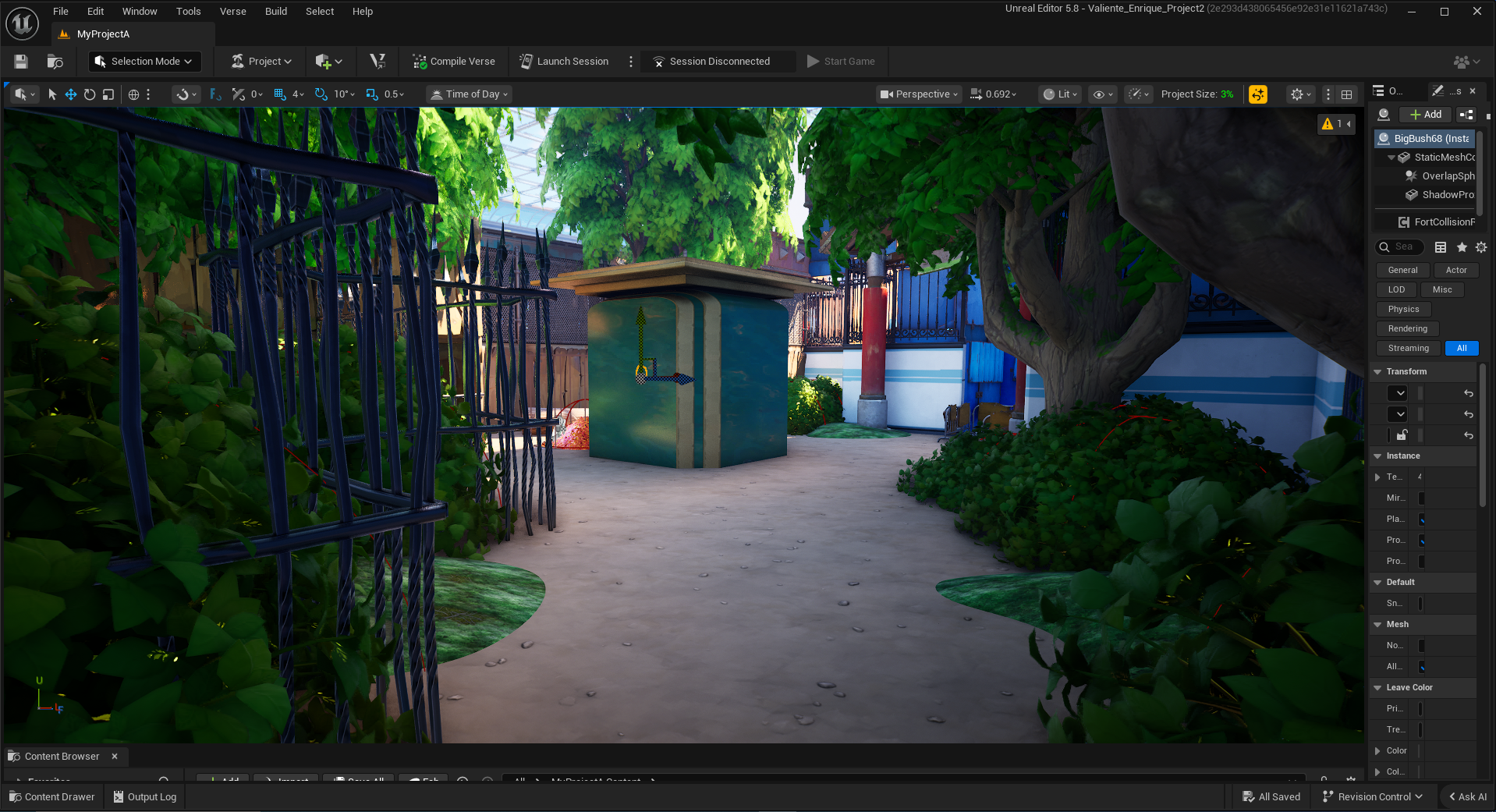
This next section would’ve been built like a small trader outpost of some kind, with more enemies in the high ridges to further challenge the player.
This is the least developed section of the level, because I realized I had made it too big and would have to completely redo it.
This final section would be a last stand type encounter, where the player must face wave after wave of enemies that are all coming out of the store at the end of the corridor. The idea was that there would be pieces of cover littered on the way closer to the store.
It was during this time that I received a recommendation from my professor to check the size, which revealed that I had made the level too big and that, due to the inherent problems it caused, I would have to redo the level.
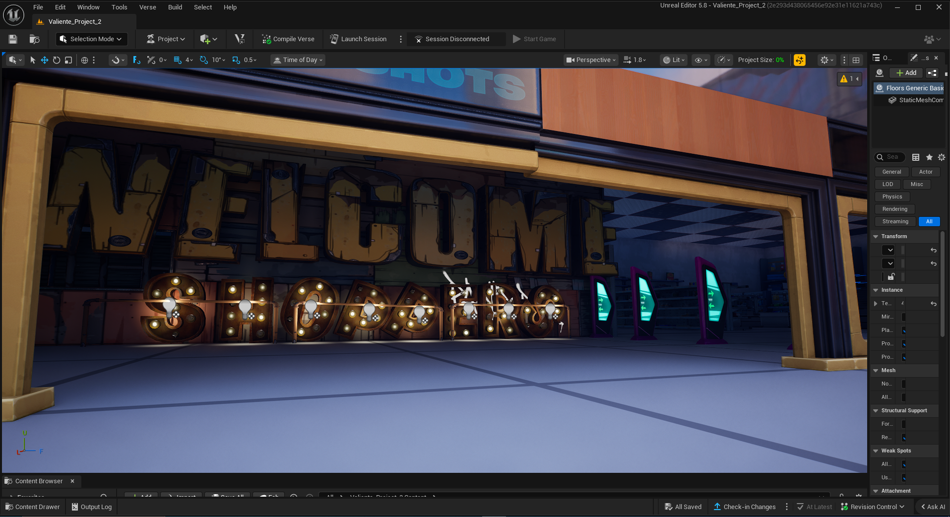
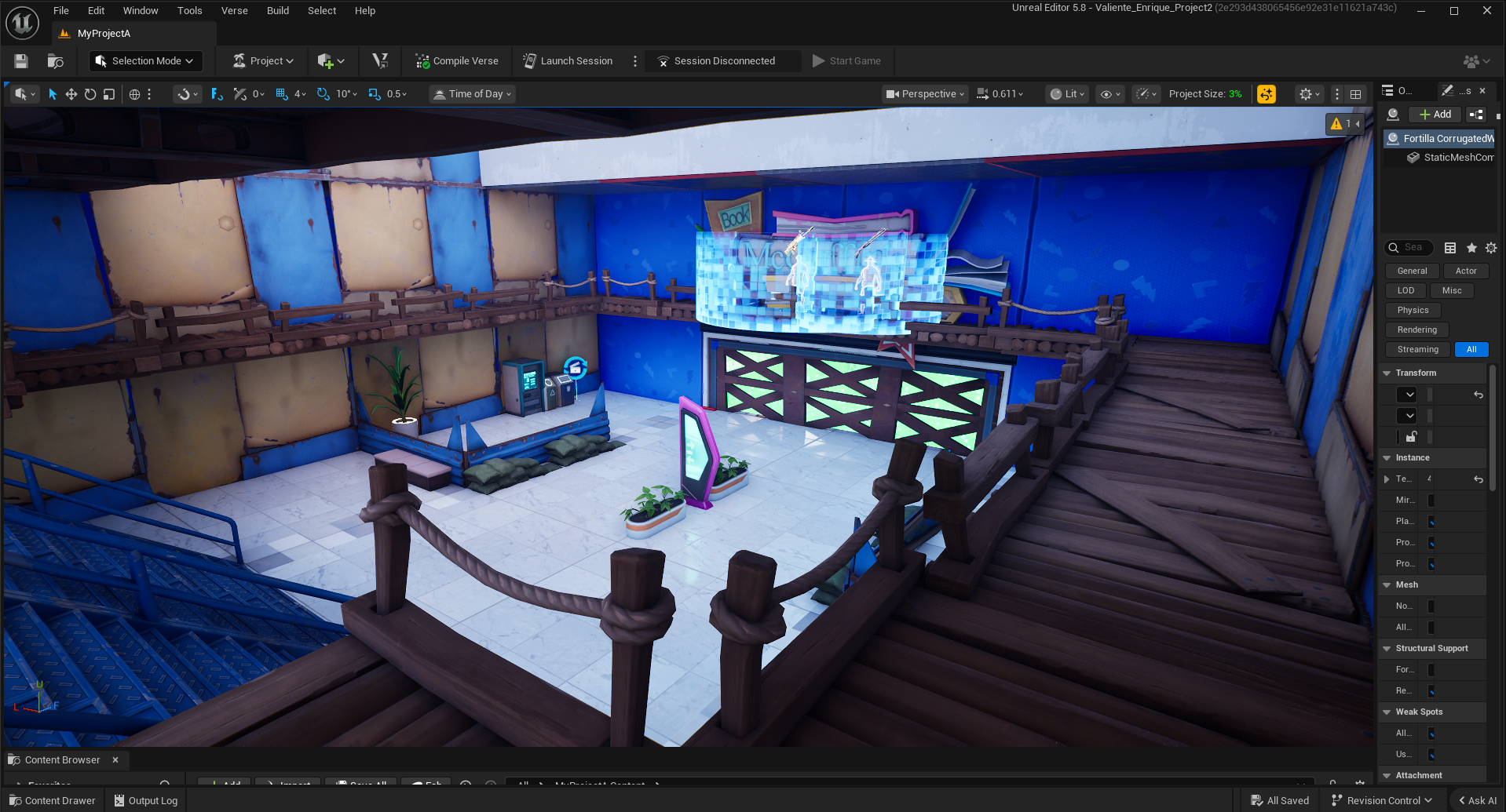
This is the entrance to the store where I tried to create an almost Old Navy-style entrance banner to introduce the player to this section.
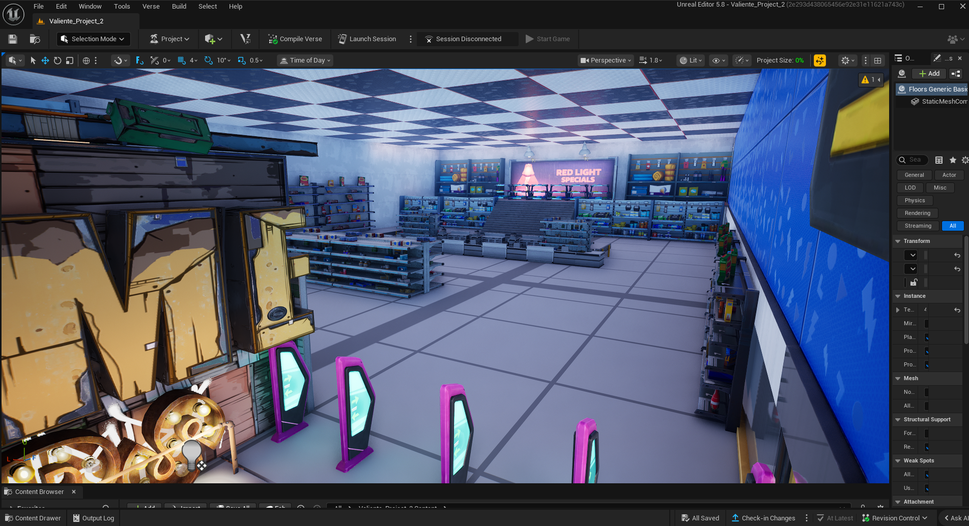
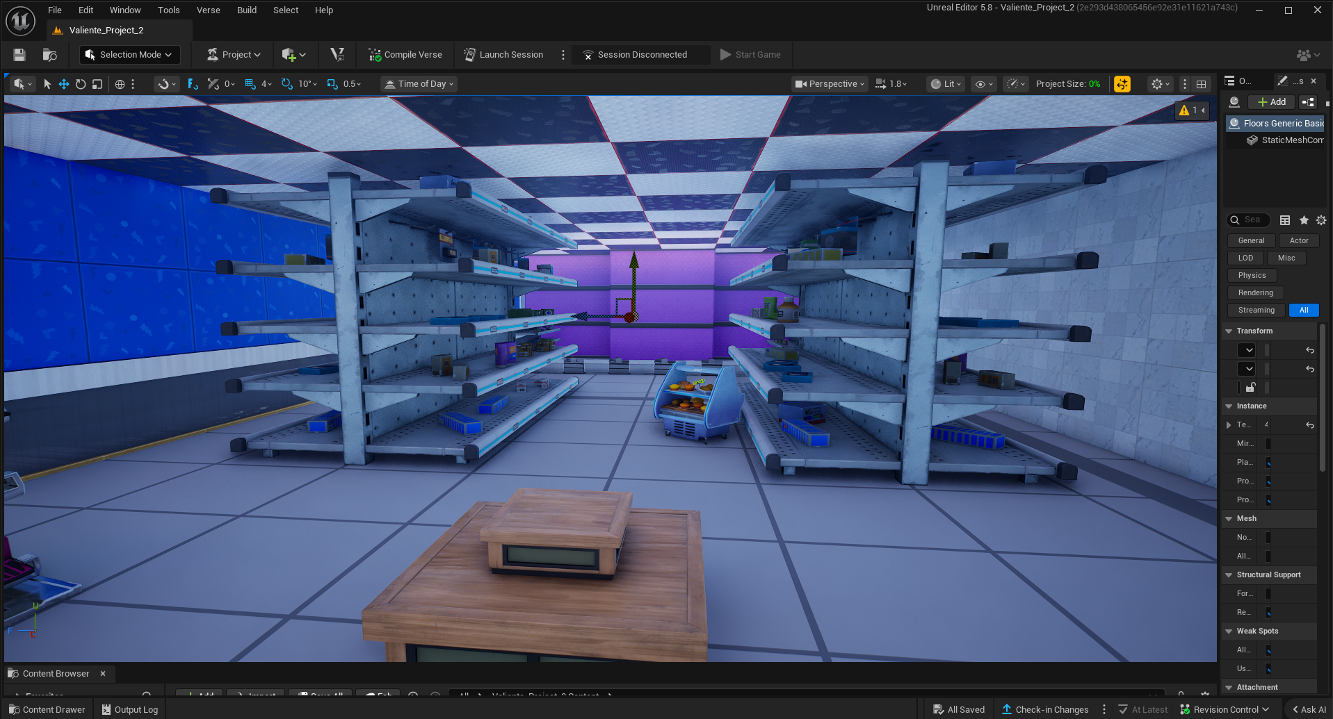
This is the store section of the level, the idea here being that after the long raid, you are now able to go in and take apart what’s left of the enemy faction as a way to show how far you have come as a player.
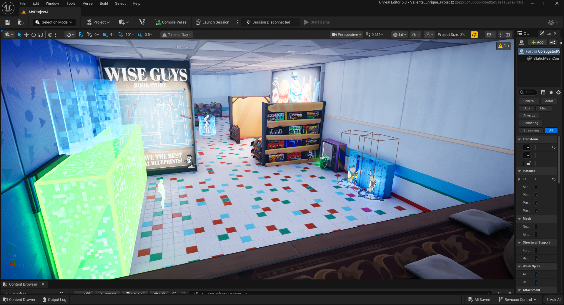
In retrospect, this section of the level should’ve shown me the level was too large, as the giant 1 block gaps between props would have made the level not only boring to walk through but also relatively barren, the opposite of a lived-in mall.
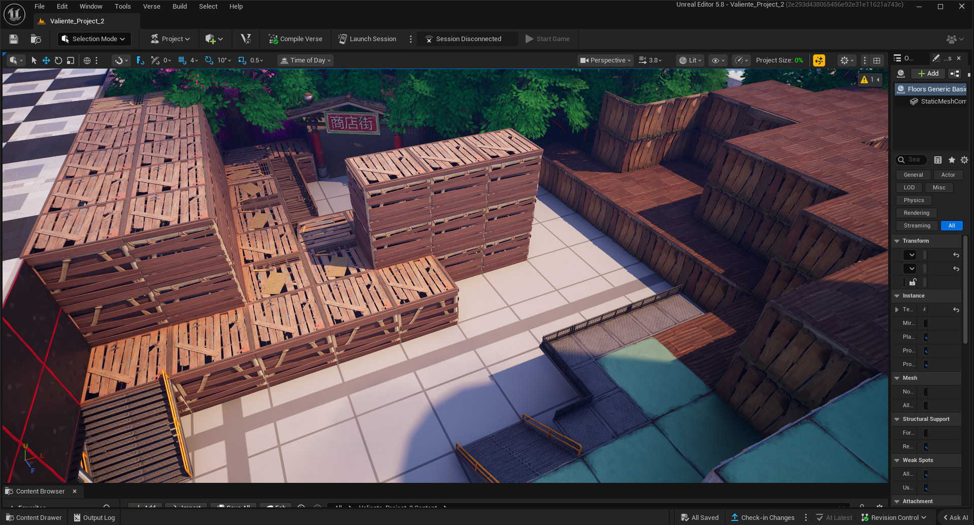
This section would have been a connecting pathway between the two cashier sections of the store. I tried to design this to be almost cozy to recreate the feeling of a department store in a mall, like Macy’s or Sears.
There is a gap between the smaller shelves, intended as a cover spot for the player and a small stash of ammo and loot for them to use to ensure their domination.
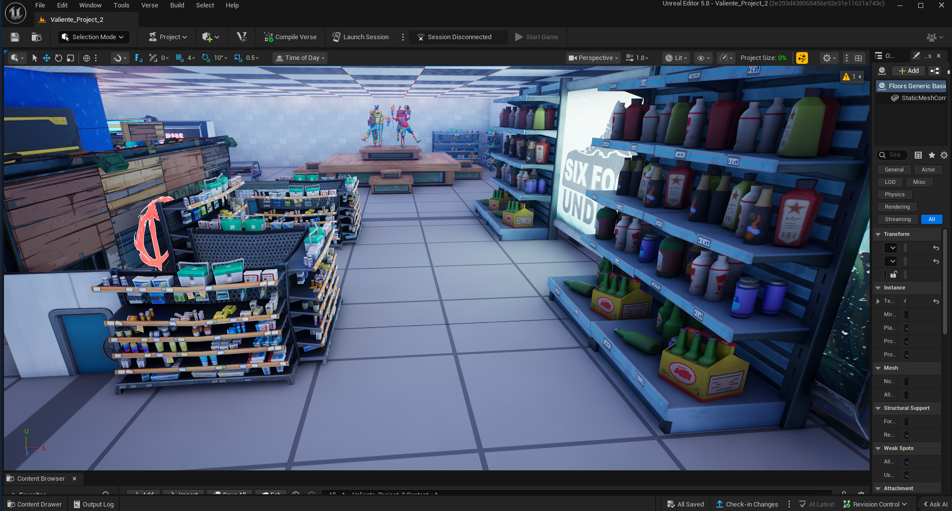
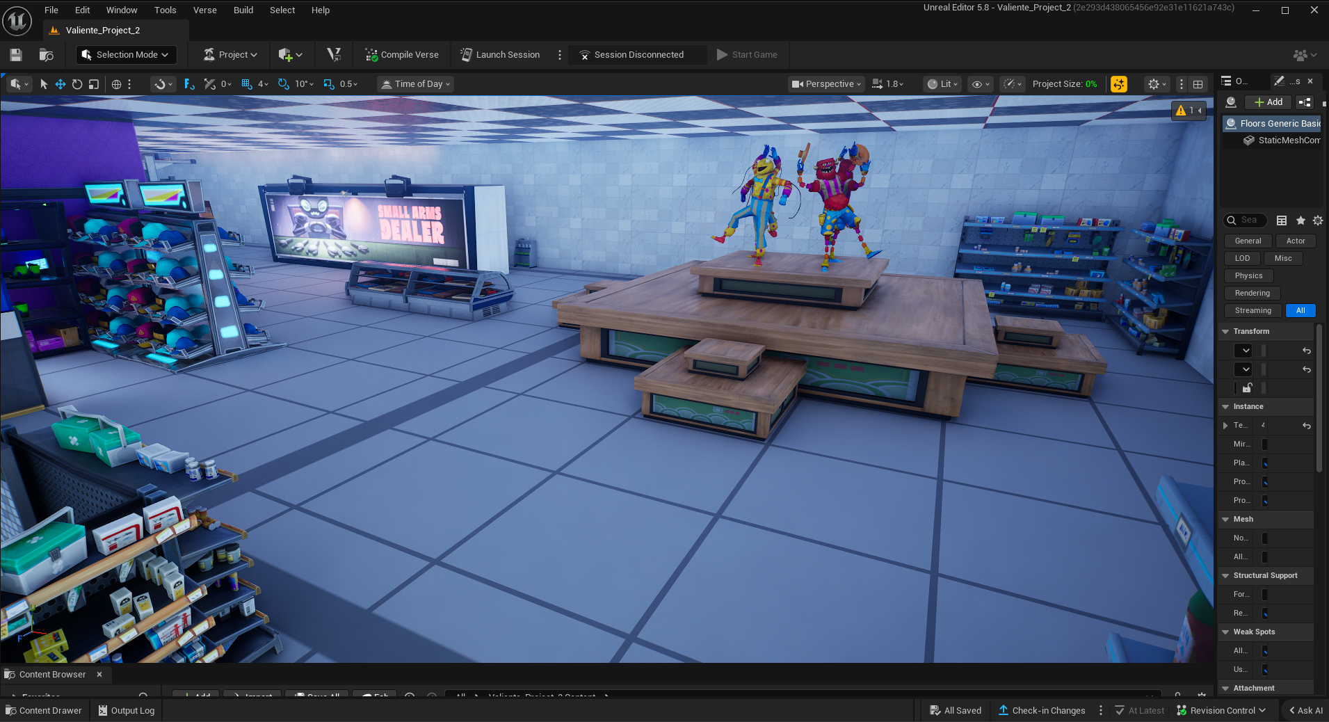
This was the showcase booth section, meant to emulate the various clothing modeling stands they have in department stores. The idea was that the player could run around this stand to obtain cover and defeat enemies along the way. In some ways, it was meant to be a small callback to what they did in the fountain.
This is the final corridor of the level, where I decided it would be fun for the player to have carte blanche in how to defeat the remaining enemies across the 3 aisles.
By taking the two edge aisles, they would have no cover but could flank the enemy. With a middle aisle charge, they’d have cover but would have to deal with a frontal assault. Ultimately, I think this would have proven useless since the player would kill them all anyway.
Assembling the New Version:
After learning of the mistake I had made in the first version of the level. I had to make a new version that effectively shrunk down the current level. I liked a lot of the concepts in the level and as such I had tried desperately to preserve some of the core identity of the level while making it a much faster experience.
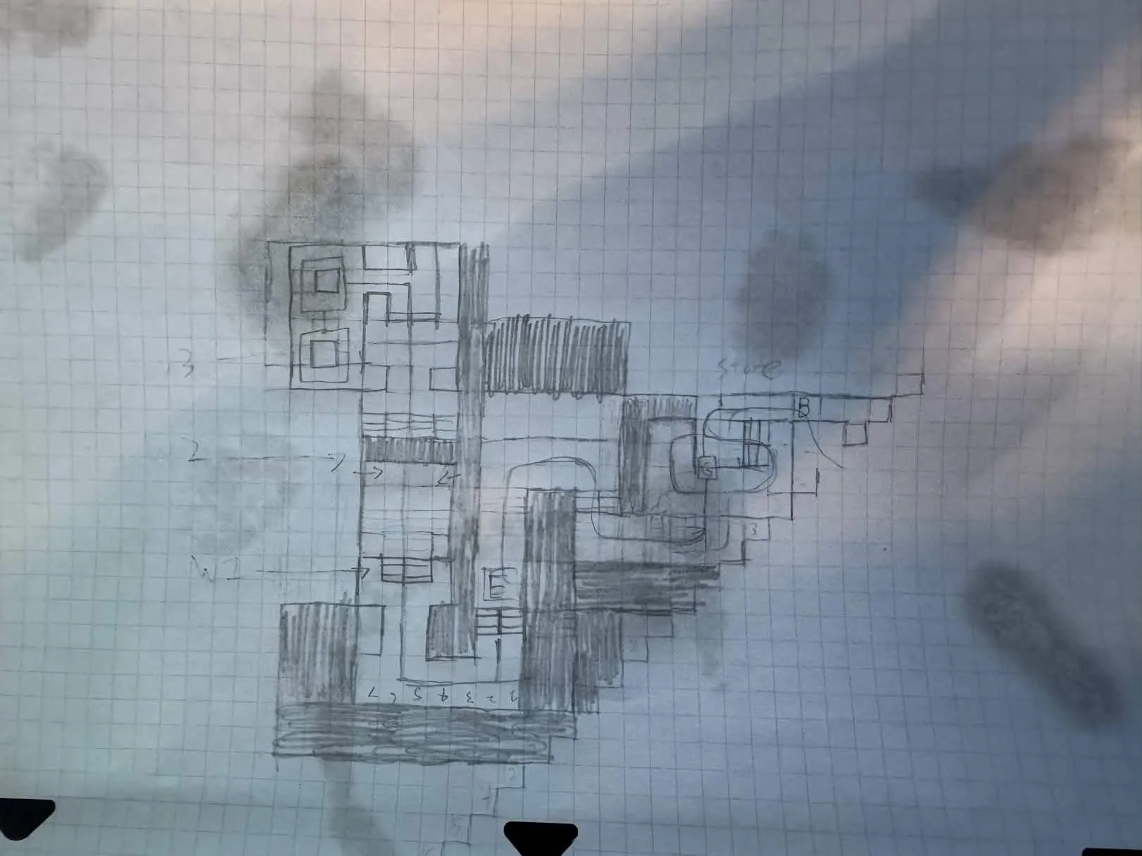
This sketch shows the calculations and layout for the new version of the opening entrance. I decided to make this area a little more populated, adding additional props to sell the idea that it is the corner of the mall's social side.
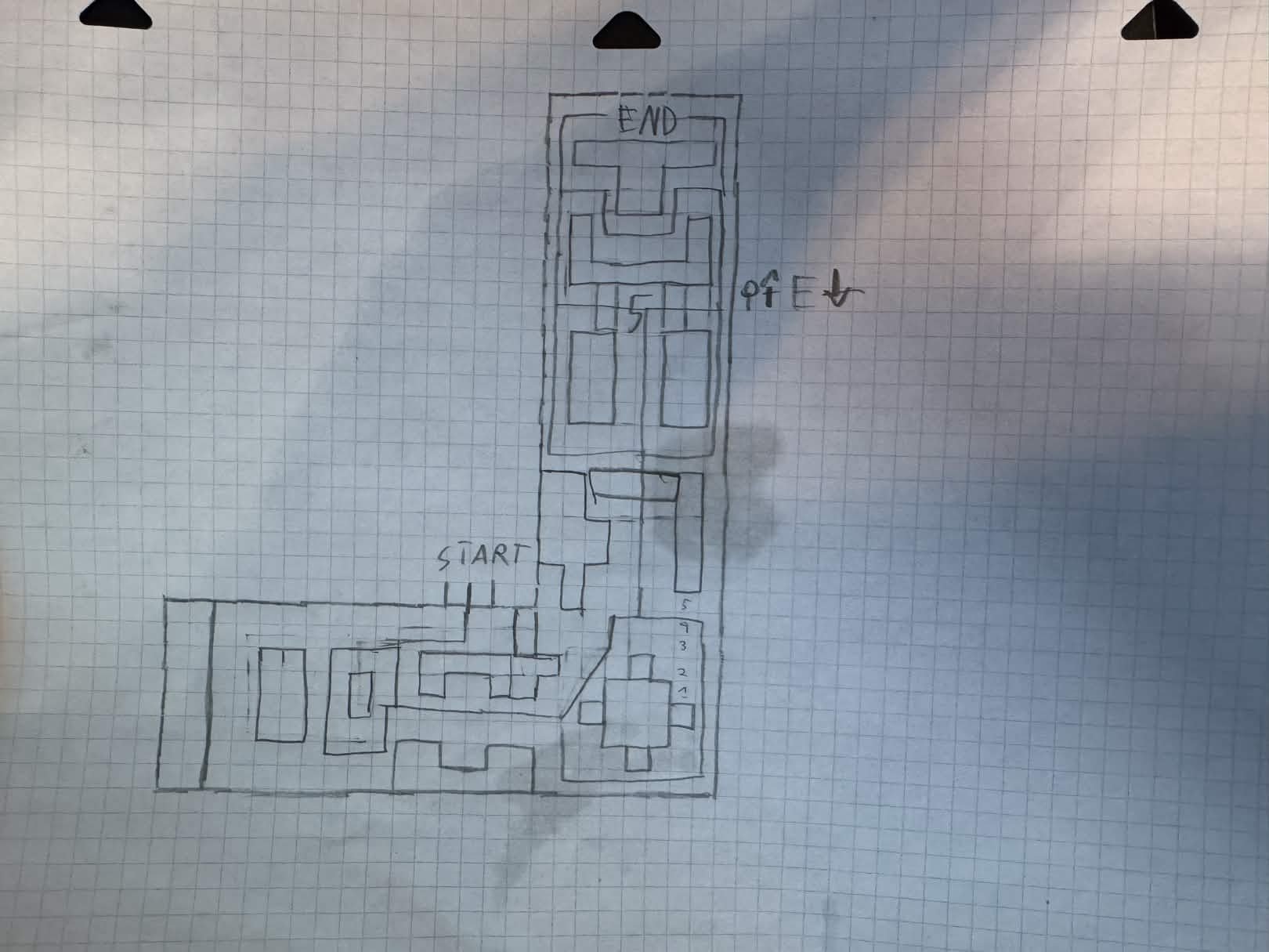
This was the brand new sketch version of the map. As you can see, I managed to fold it in half, reducing it to the size of the original!
I tried my best to preserve many of the core ideas from the original, such as maintaining the same layout for the final encounter and the 4th encounter. However, once in development, I would steer away from some of these ideas, as the smaller size proved too limiting for them to function as intended.
This is a sketch of the final section of the map, which I did an alternate version of after not being satisfied with the flow of the version in the first sketch. This changed the fourth encounter to a much more enclosed space as opposed to the arena style it had originally.
I tried to be as conservative with space as possible, not wanting to repeat the same problem I had with the previous version of the level.
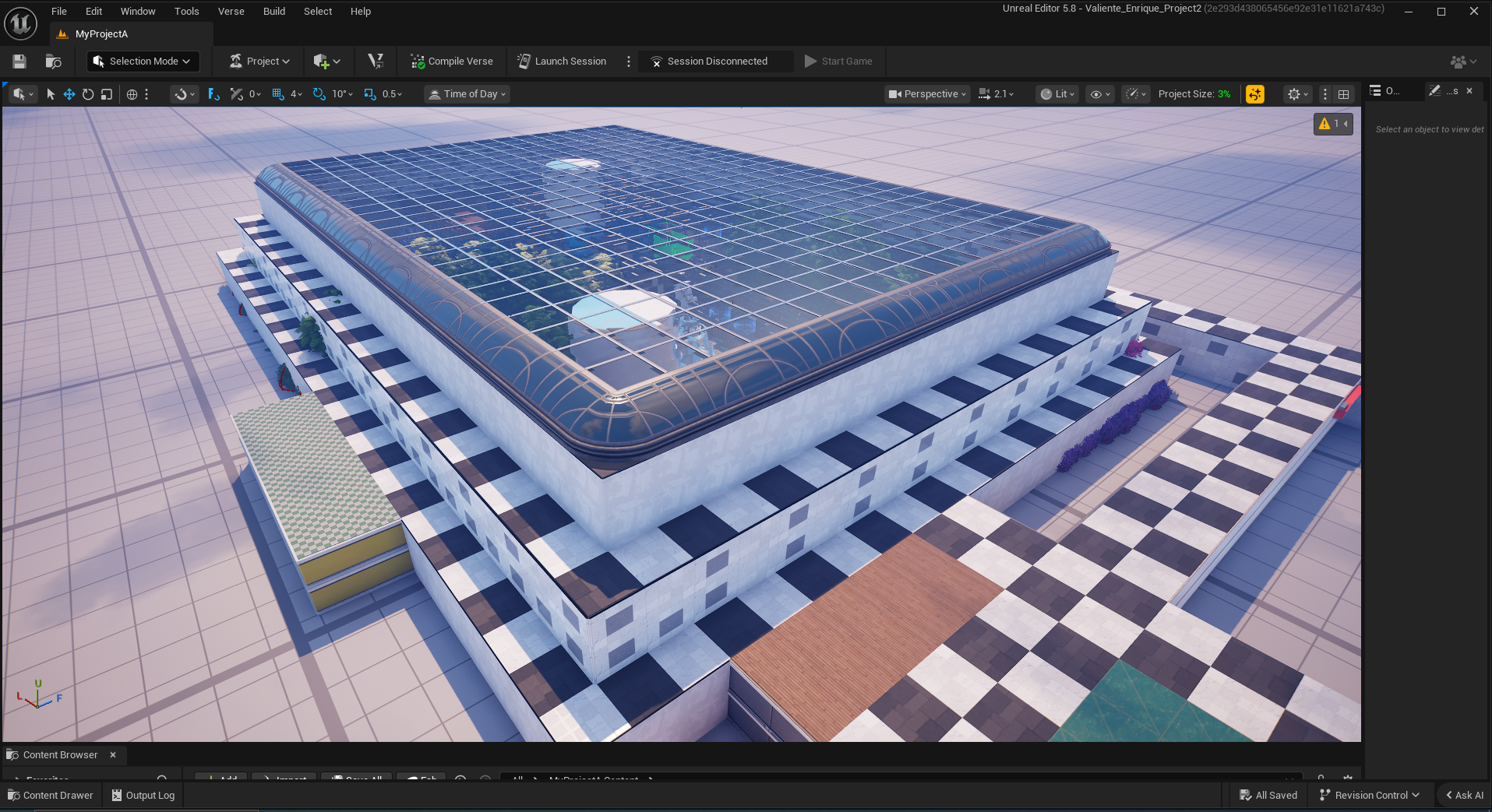
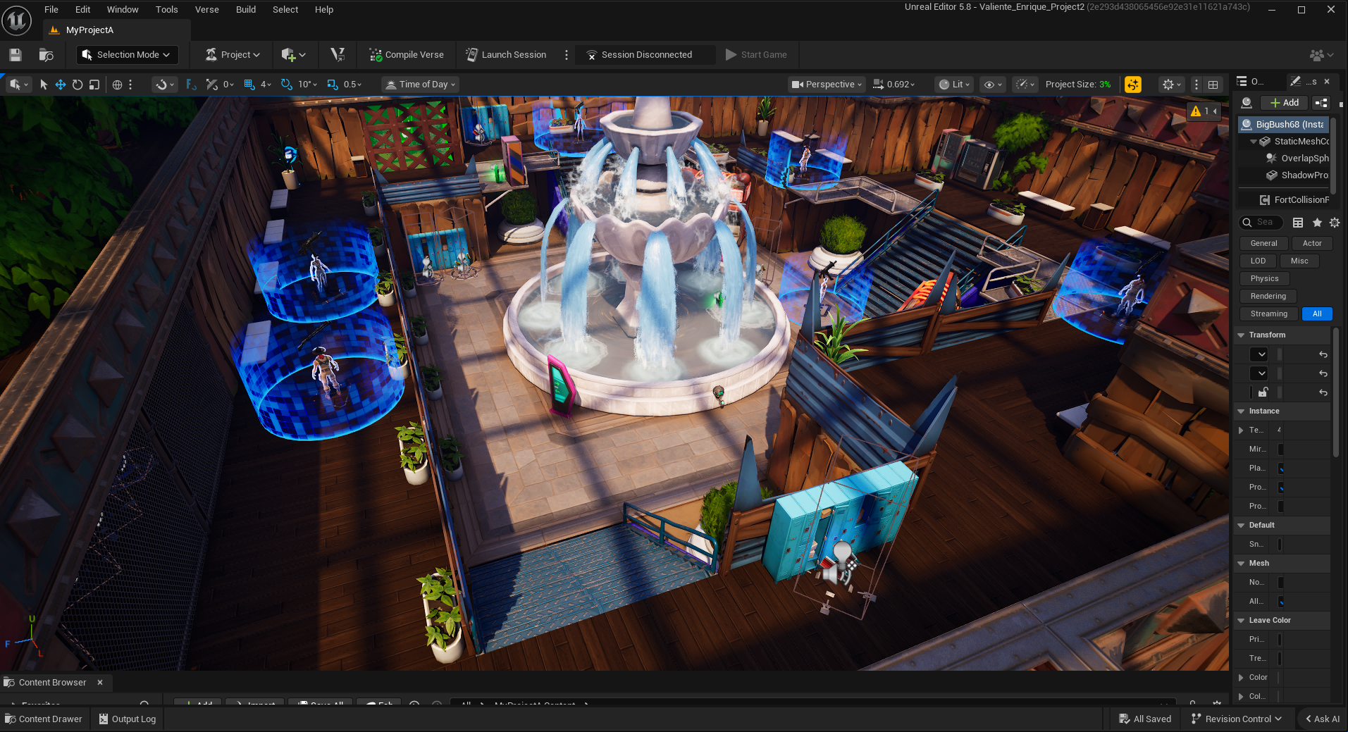
This is an overhead shot of the new version of the level. The original version was open concept in its park area, resulting in a different cibe that I didn’t quite like as it felt too freeing. I wanted the player to feel trapped in the mall.
I achieved this trapped feeling by installing a glass roof over the whole thing. Not only did it let light in, which provided diegetic justification for the park's flow, but it also gave the whole area a greenhouse feel.
The First Encounter
This is the player's new starting area. It’s much smaller, don’t you think?
I added several new props as a way to give these halls life, including using some to be easy signposting for the player to find the items they need, such as the tables holding guns and ammo
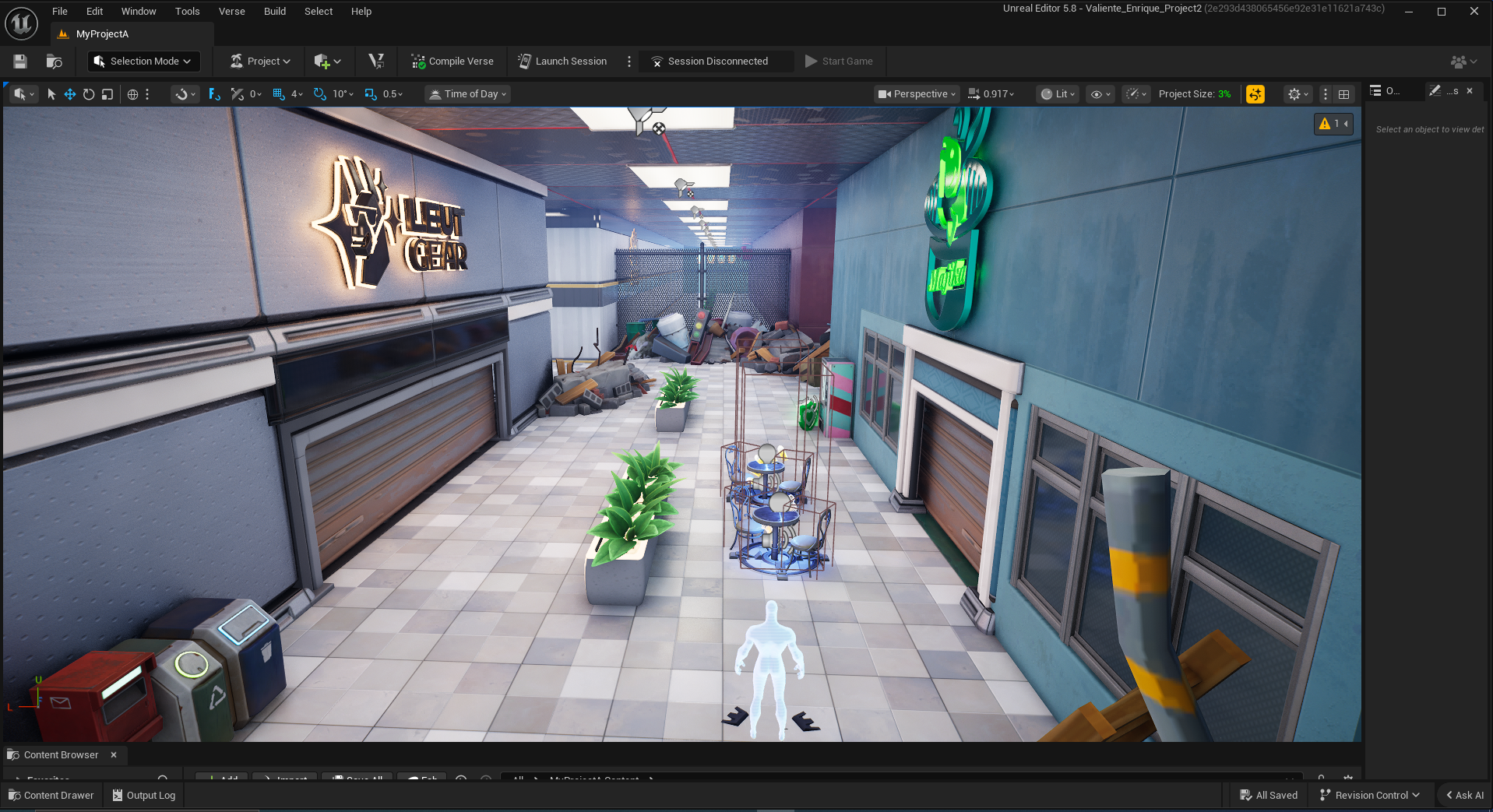
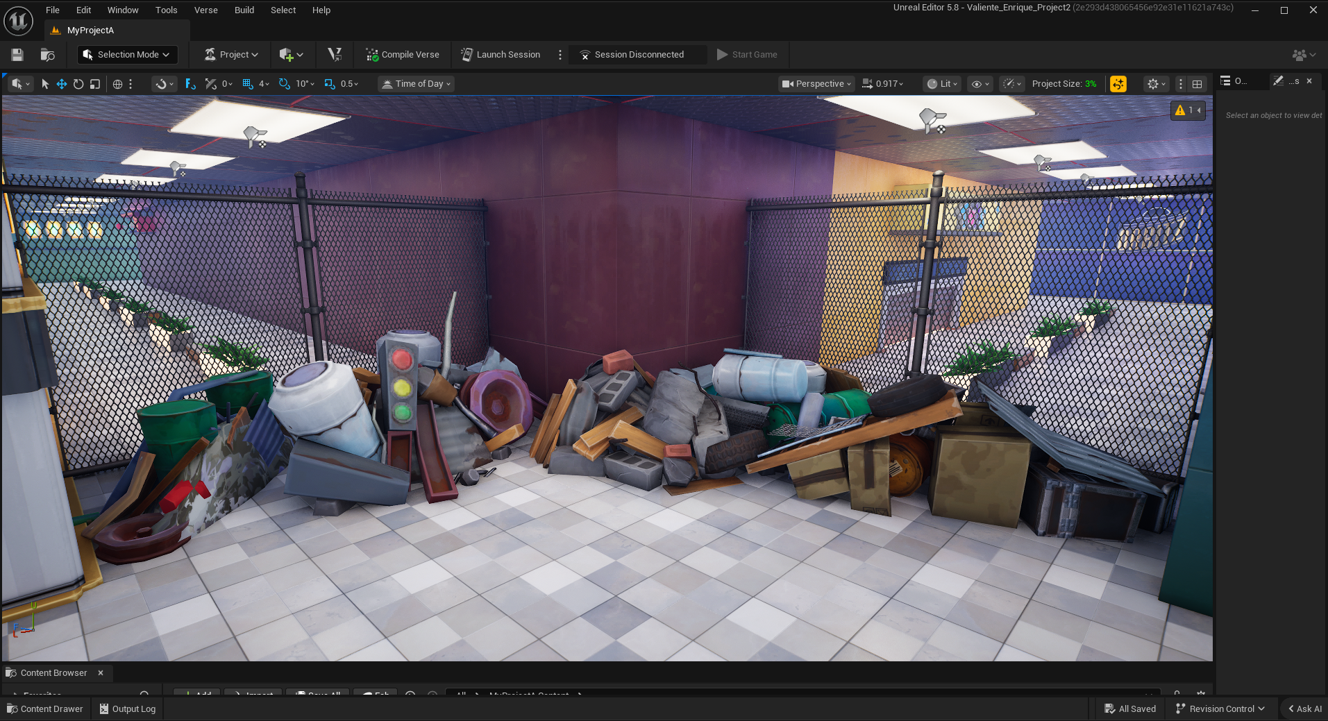
I took the junk wall concept from the version and decided to double down on it by adding the closest I could find to shutter gates, like the ones you see in department stores. This was a diegetic way for players to block off in the level.
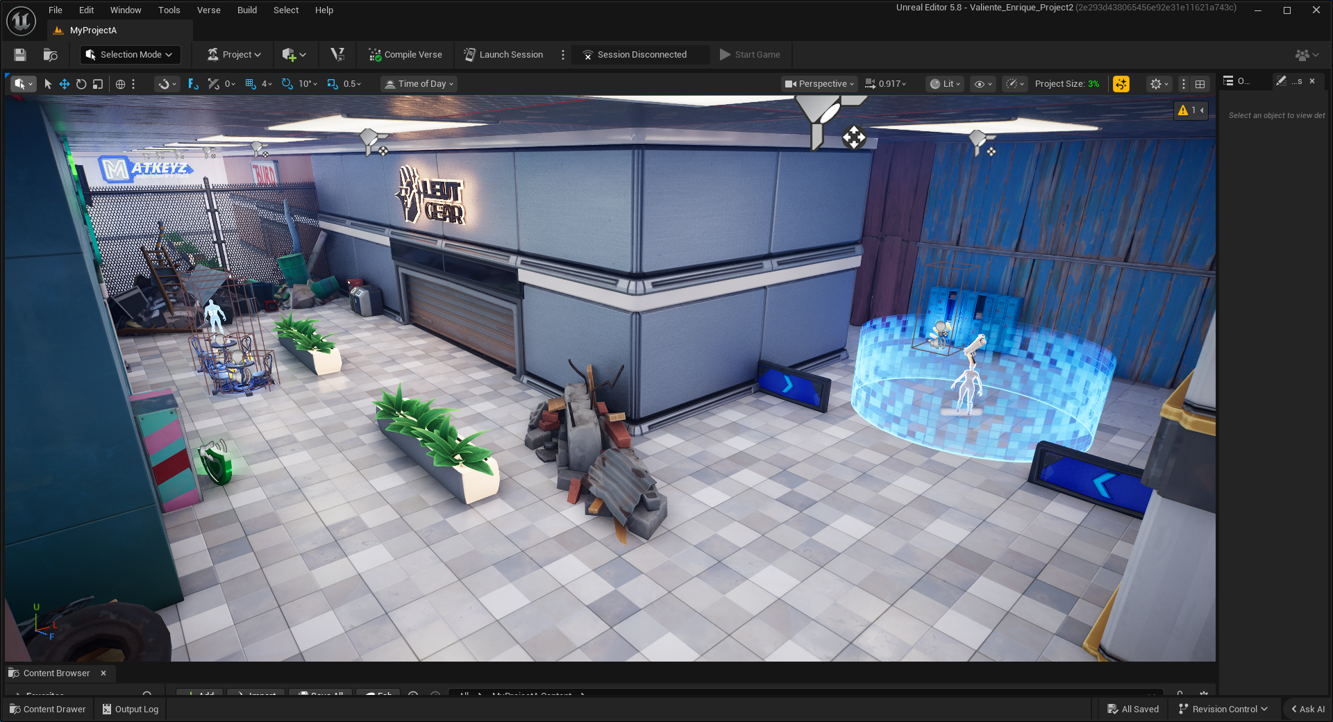
A little after the player gets their weapon, they get their first encounter. Much like the old version, it’s meant to give the player a chance to get their bearings with the controls.
I added an extra level design concept to make it even easier to navigate. Color theory. I deliberately chose all objects that lead the player down an intended path to be blue, as shown by the blue walls in the corner.
This is the restructured first proper encounter in the level. It’s been redesigned to be heavily weighed in the side of the player.
Most of the enemies are positioned at the bottom of this small plaza so that the player may ambush them and take advantage of the high difference to pick them off one by one with their starting weapon.
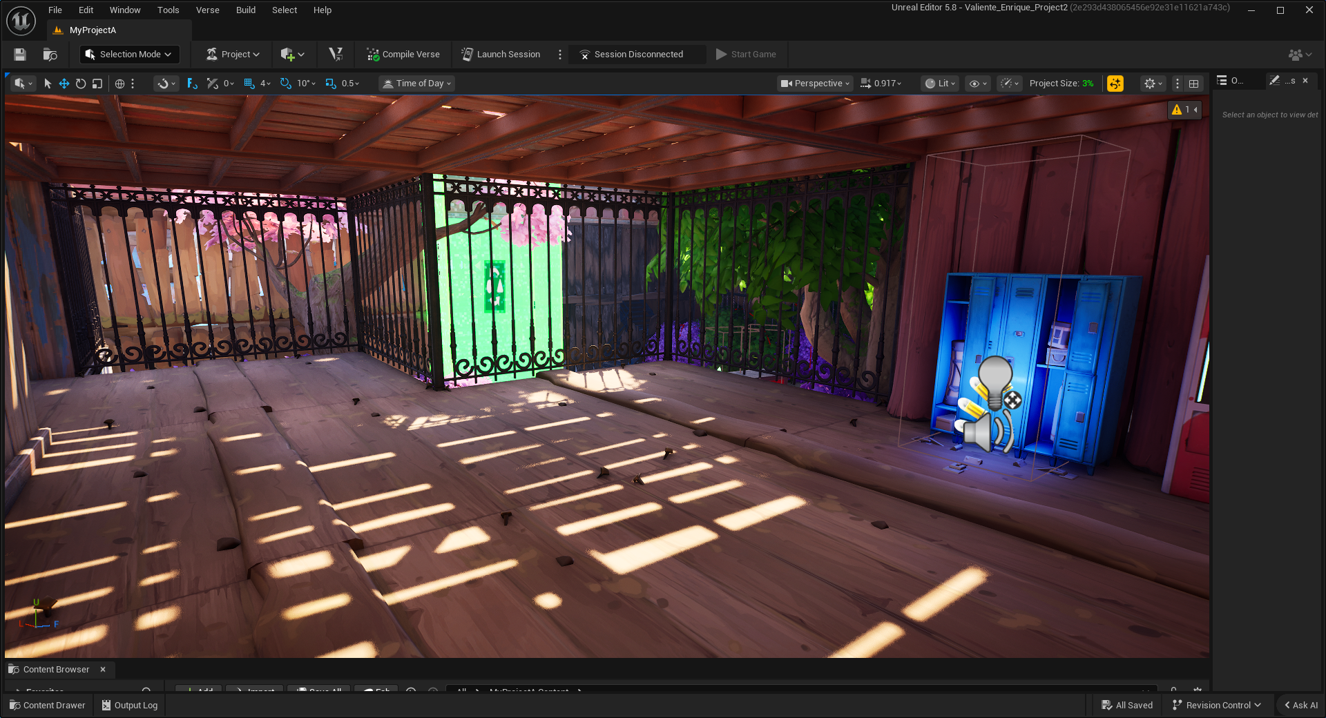
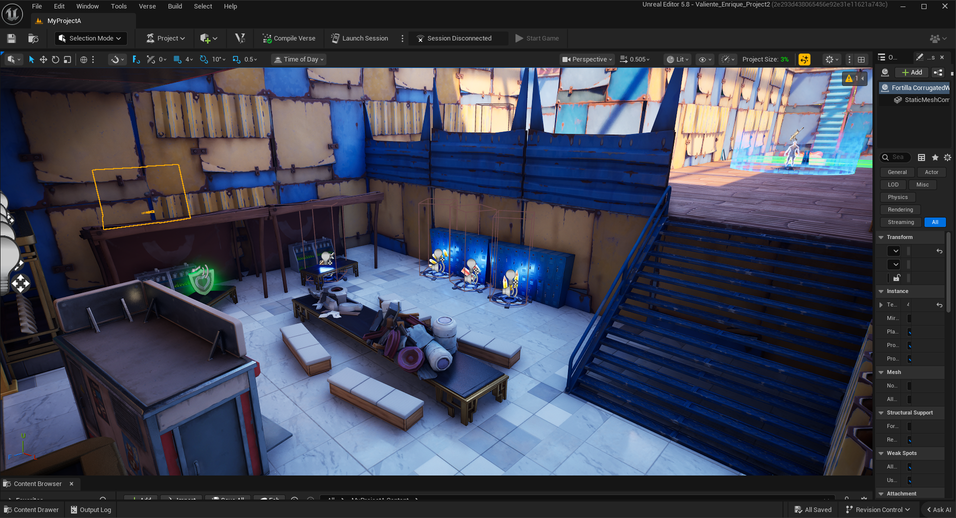
This is the first rest zone between encounters where the player can ease down slightly after an encounter. I took advantage of these places to hide future secrets, such as being able to see the secret of a later section through the park fence.
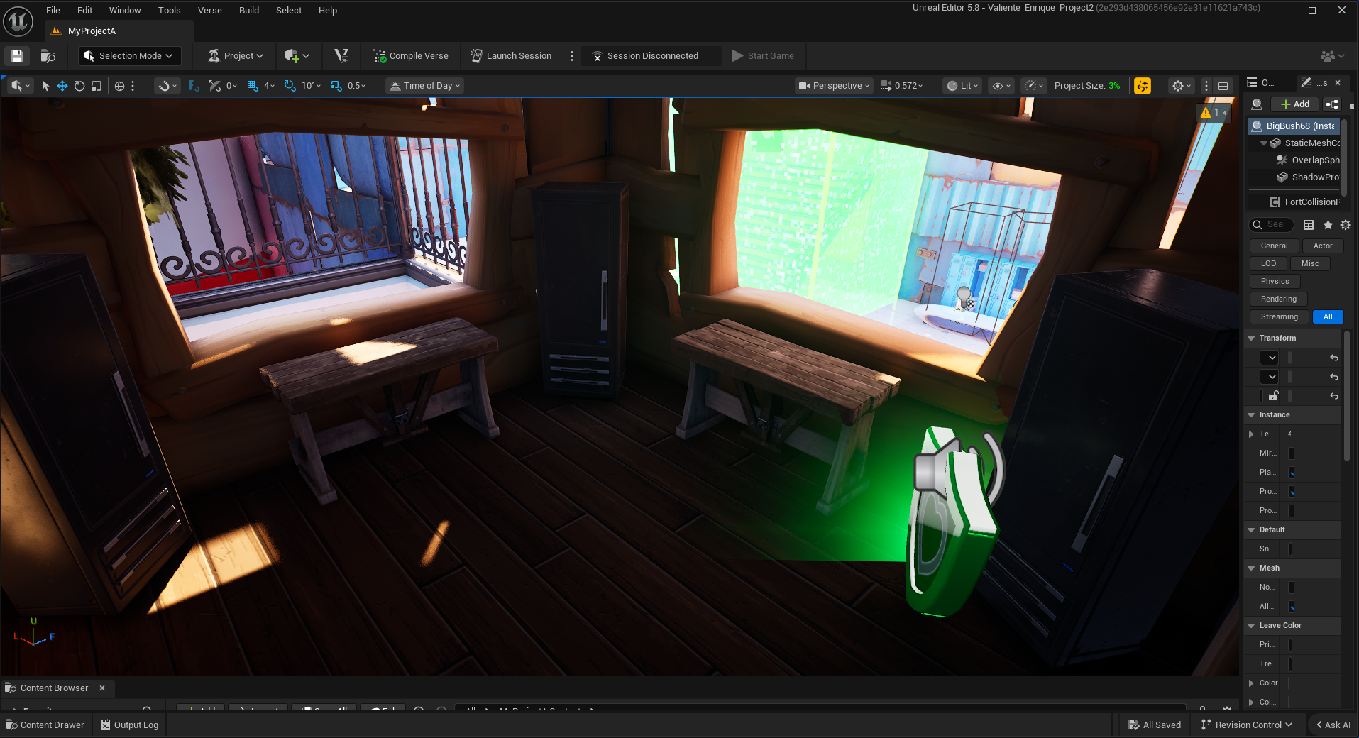
I also tried to make these break zones feel lived in, including furniture and lockers to show that this enemy faction had some organization and routine. It also served as a way to make the placement of ammo and health diegetic.
Not far after the rest zone, the player will encounter their first stronger enemy, the shotgun soldier. Intended to have a poor aim to hurt really badly when they get a hit.
I decided to take a page from platformers and introduce new enemies in isolation from other enemy types as a way to get the player used to them
This is the first transition encounter. These encounters are meant to be exams for the player on what they have learned so far. This encounter features two shotgun enemies and the basic low-aim, low-damage pistol enemies, introducing the concept of combining enemy types.
I also tried to incorporate more defined stores to the mall sections, as such, these enemies are stationed in front of a pizza restaurant! I figured it was fitting to have one next to the park.
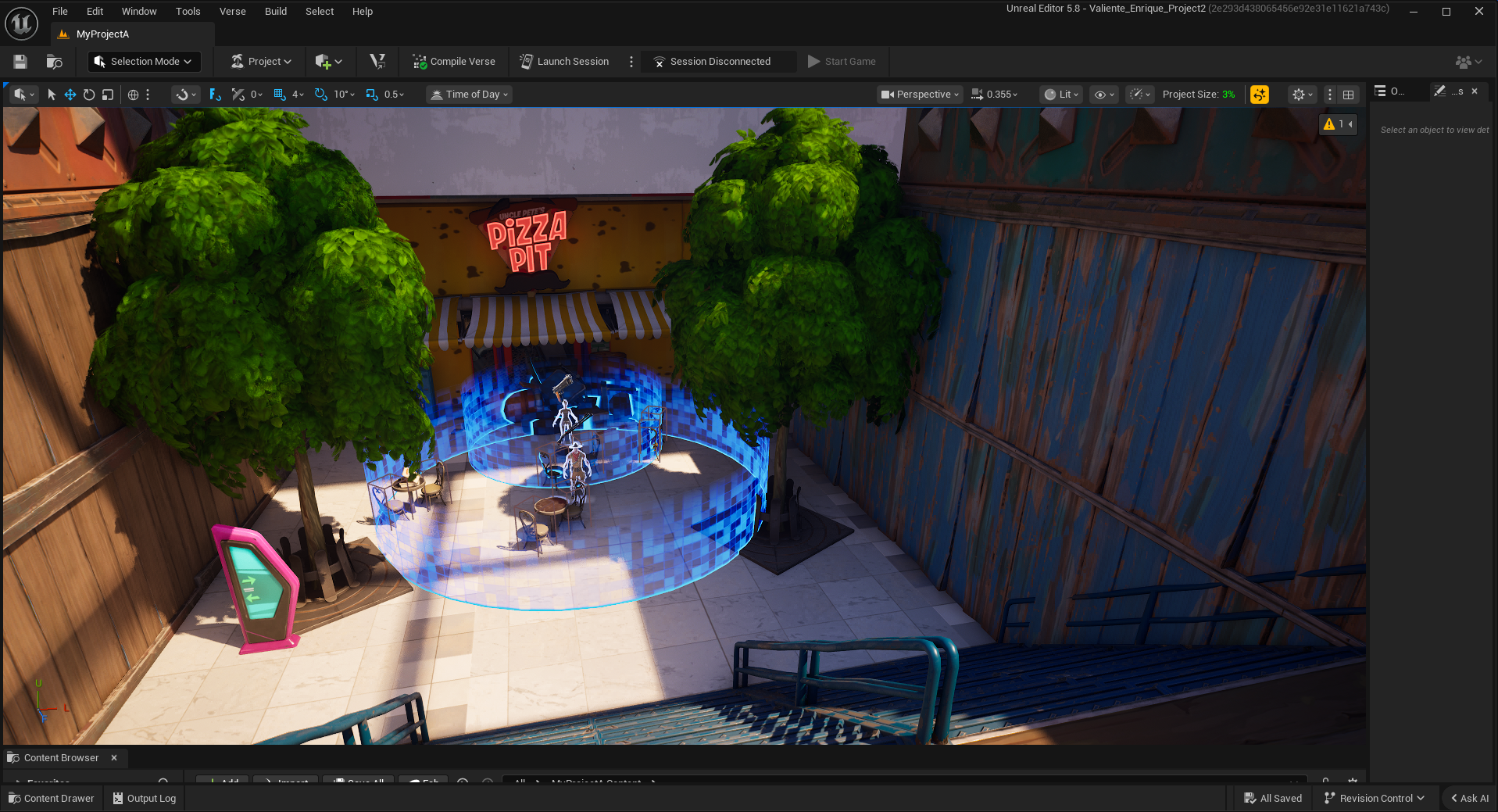
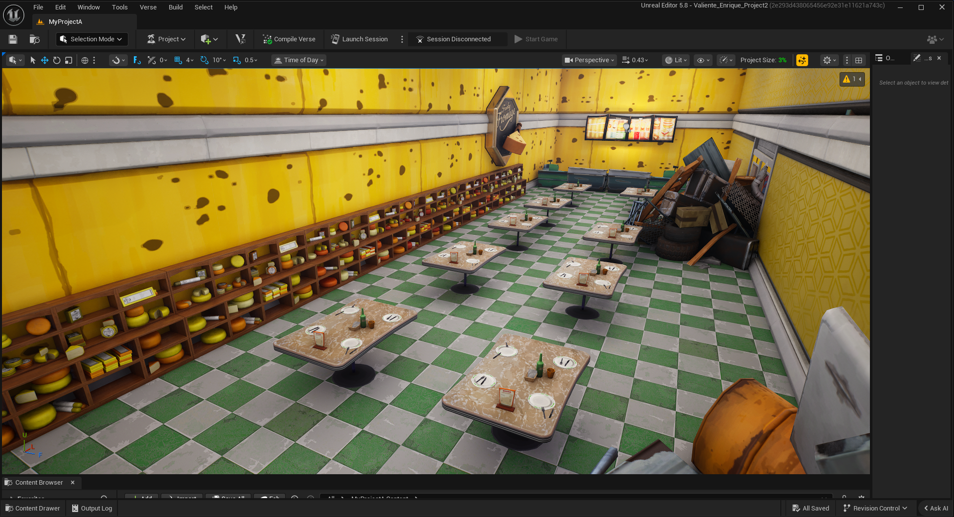
Since the player can peer inside through the cracks of the junk piles that block off access to the restaurant. I made sure to model the inside of the just in case the players decide to check.
It is frankly shocking how many cheese-based assets Fortnite has.
This is the exit to the next section of the level, the park. This is designed to be another rest zone and as a subtle showcase to the player that there are secrets all over the level.
I also played a lot with natural light in this level, using it to slowly guide the player where they need to go, as in this shot.
Here is the second secret area of the level, which is just above the previous combat zone. It’s accessible through the stairs seen in the previous shot.
In the previous version of the level, I wanted to encourage exploration by offering many paths to reach the player's objectives. However, with the smaller size, the map became much more linear; as such, I still included a bunch of secret areas to encourage exploration.
The Second Encounter
This is the entrance to the park, now redone with this new level.
I attempted to compress the park rest stop idea from the first version with these new square rest stops. I intentionally positioned them so that the lines had a subtle leftward curve, the intended path.
And just in case the player misses the rest stop lines, the mall sign provides diegetic direction.
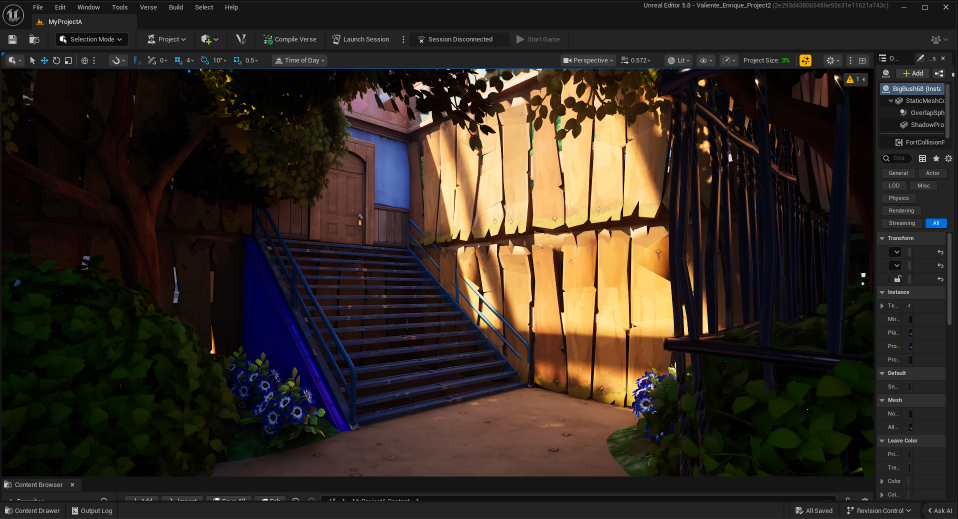
This is the pathway to the next major encounter. I once again played with natural light in this section by having the entrance to the next combat encounter glow with light from the roof.
Throughout the level, I also placed checkpoints. One for every encounter. This was done to ease any frustrations upon dying. Even with it compressed, the level is still quite high, and traveling all the way from the first encounter would be a hassle.
This is the second major encounter of the level. This one is meant to be a much fairer firefight, with both the player and the enemy at the same height.
This encounter further expands on the number of enemies, now containing 5 enemies, two extra from the previous encounter. This is to prime the player for the larger enemy amounts later on.
The garden is designed to provide some cover for the player to fall back on should they get hurt, such as the small alcove near the start and the fountain itself, which serves as additional cover.
After the second encounter, the player gets their next weapon, the shotgun, intended for medium- to close-quarters combat.
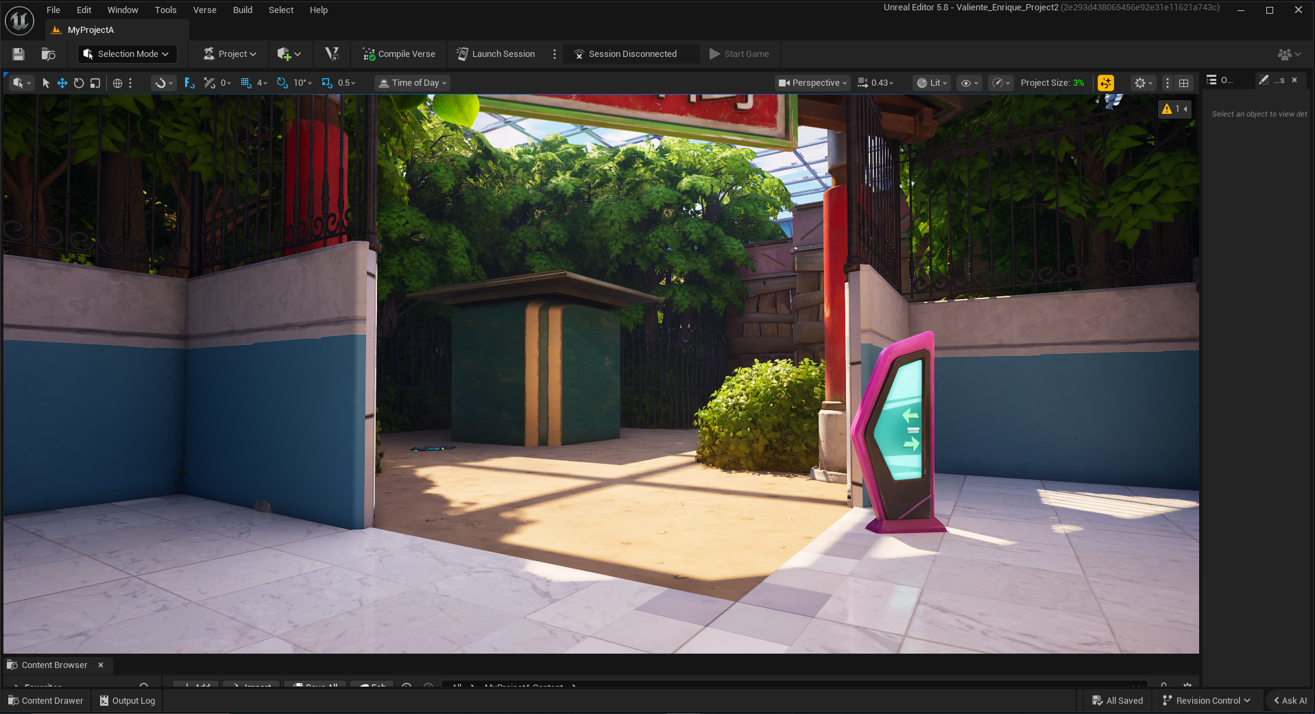
The player will also be shown the next secret area, but not told how to access it, though the dented fence near the corner subtly hints at it.
Something important to note is that in the game version. All the trees in this section are blue, with any trees that don’t lead to the main path being green, to further explore color theory.
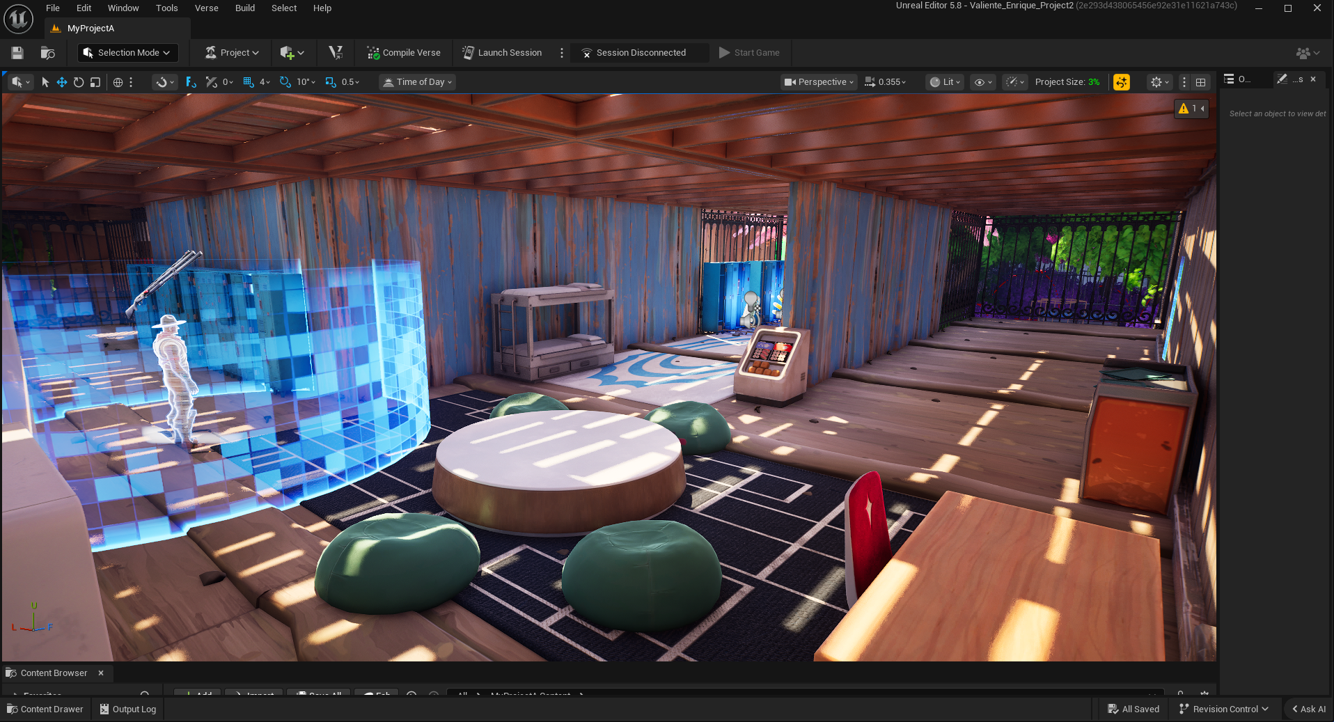
This hallway is meant to serve as another rest zone for the player and to introduce the new enemy type—the SMG soldier.
The SMG soldier is effectively just the pistol soldier, but with more health and a better gun. The corridor serves to introduce the enemy’s strengths and weaknesses to the player in a safe environment.
This is the pathway to the next major encounter. I once again played with natural light in this section by having the entrance to the next combat encounter glow with light from the roof.
Throughout the level, I also placed checkpoints. One for every encounter. This was done to ease any frustrations upon dying. Even with it compressed, the level is still quite high, and traveling all the way from the first encounter would be a hassle.
This is the entrance to the third major enemy encounter in the level. This shows the two major tools I used in this level to guide players: color and light.
The Third Encounter
This rest stop, which contains two demarcations, marks the halfway point of the level. It’s meant to be a true pause to the action as the player is protected by two doors that hide them from the view of all enemies. players here can pause for a snack break or re-evaluate some things such as weapon positioning in the menu.
I also show another easy-to-miss secret here that appears later in the level for keen-eyed players.
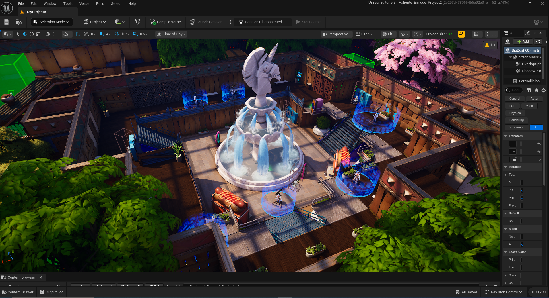
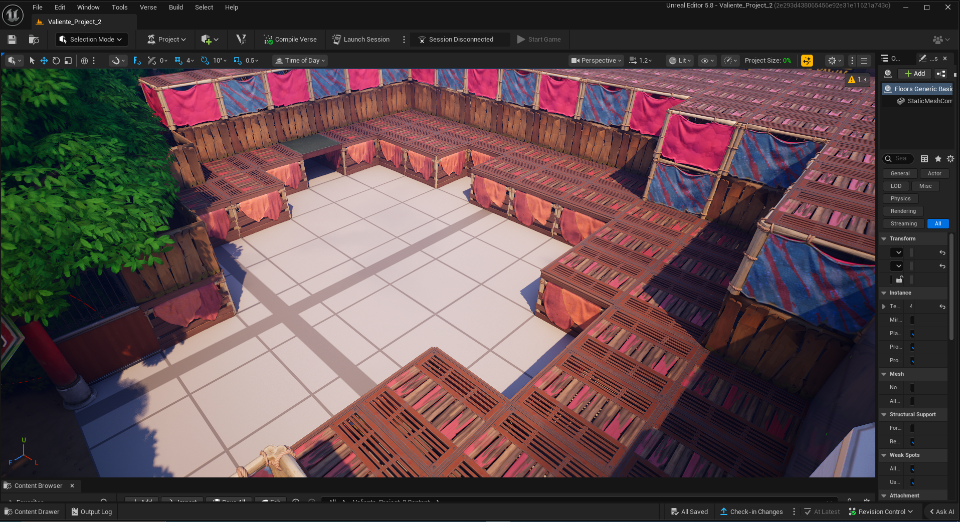
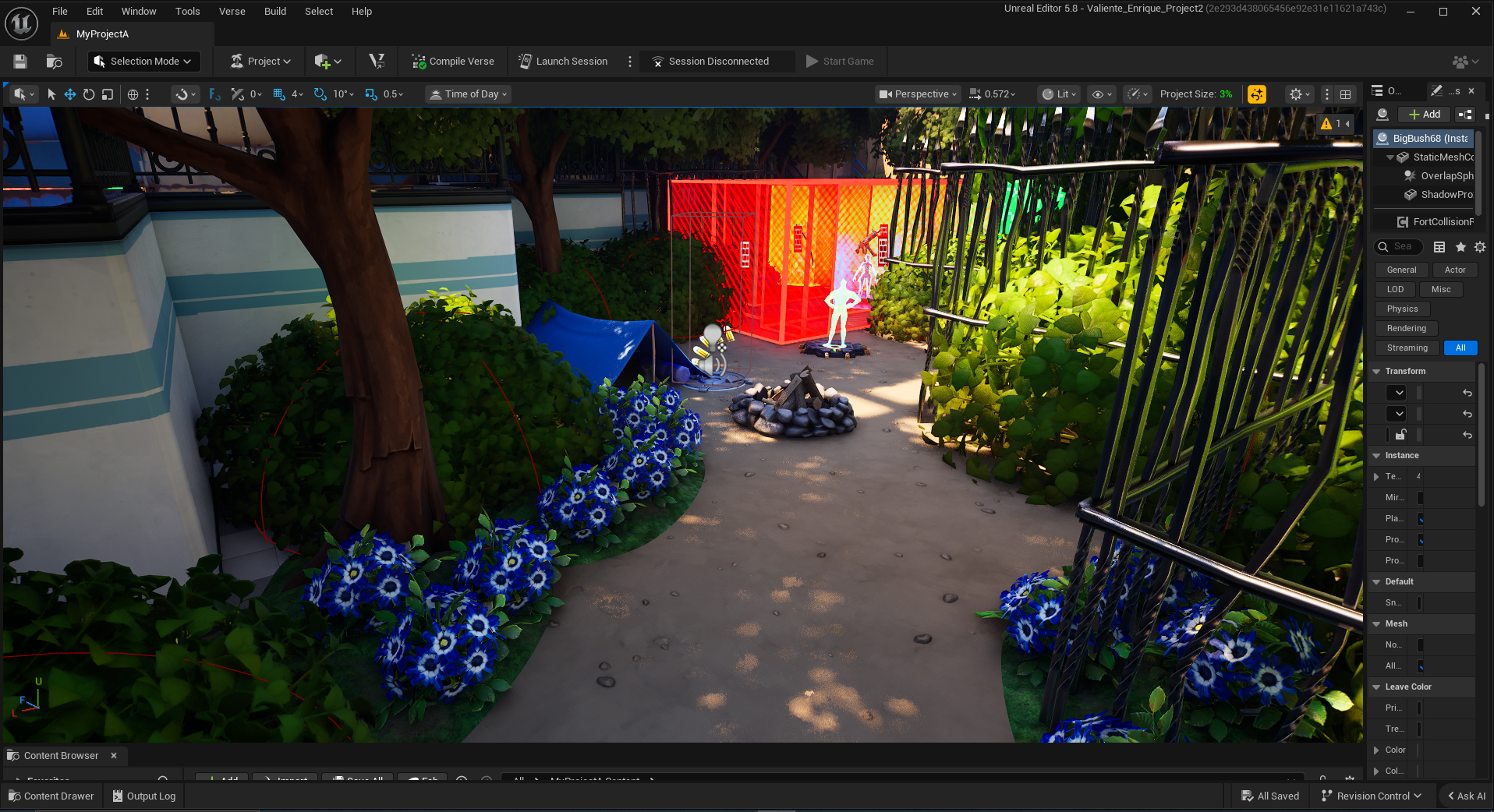
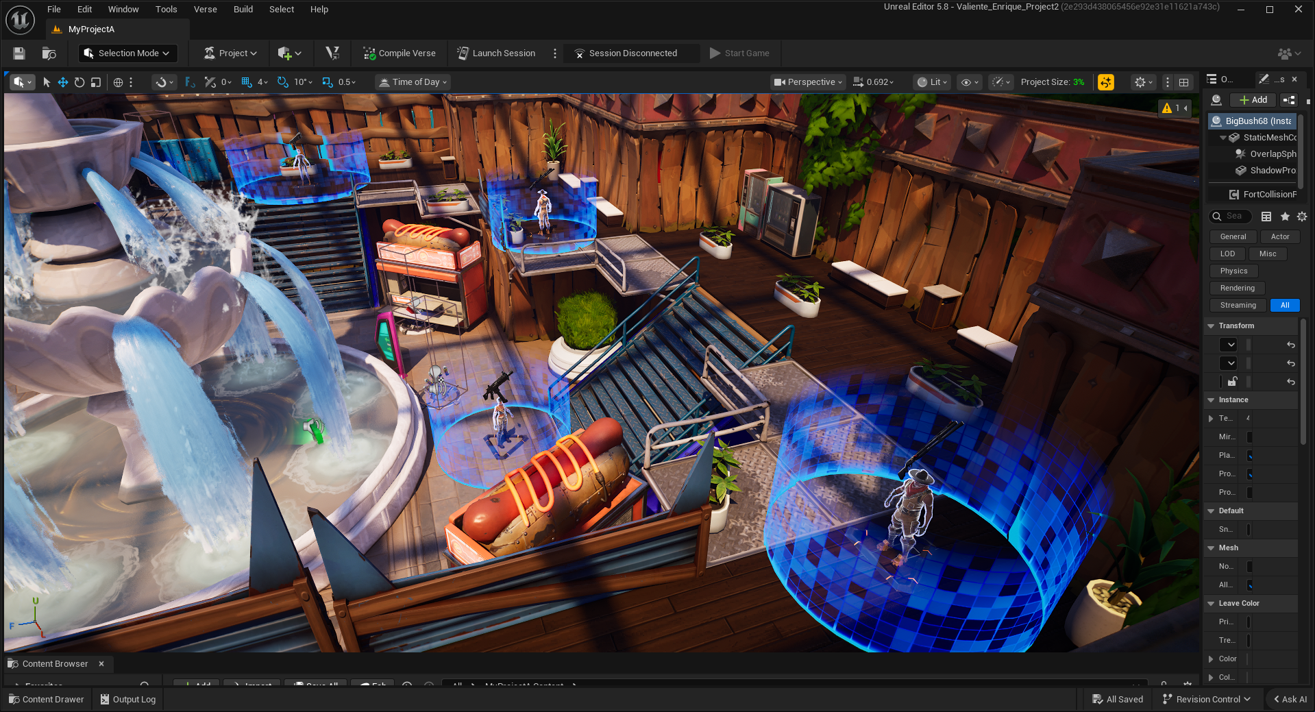
This is the third major combat encounter in the level. This fountain arena is meant to sell the player on the fantasy of the scenario—the idea of an enemy faction having built its fort in the plaza of a mall.
I tried to sell this as much as possible by creating a clash between the constructed and natural elements. For example, using concrete and various mall props on the bottom floor to show that they were constructed on top, rather than with.

This level is much like its intended predecessor. Has enemies both on the top and bottom floors, with the idea being that the player must use both floors efficiently to clear this area
I achieved this by having a large number of weak enemies on the top floor and fewer, but stronger, enemies on the bottom floor. Letting the player strategize on how to tackle the mission.
A subtle trick I used to encourage the player to go through the different floors is to place more cover on the right side of the map, which also leads to the easiest-to-access stairs in the arena, allowing them to take an optimal route without thinking.
After the third major encounter is brought to the other half of the park, which is pink, much like one of the park sections from the first idea.
From here, you can also see the window that you first saw at the start of the level, both cluing in the player to the secret right behind them, as well as showing how far they’ve come.
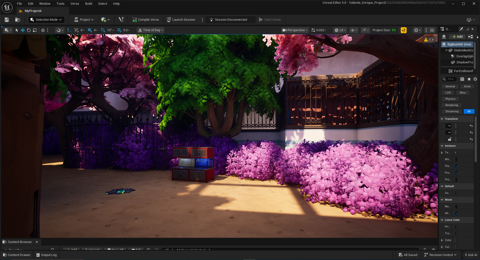
Unfortunately, I think I didn’t make this secret as obvious as I could have. The fence's railings may obscure the texture change when viewed from the perspective of the first time you see this secret.
It’s also possible that the texturing may have been too similar to the other textures being used, so that no one would tell from an immediate glance what it was
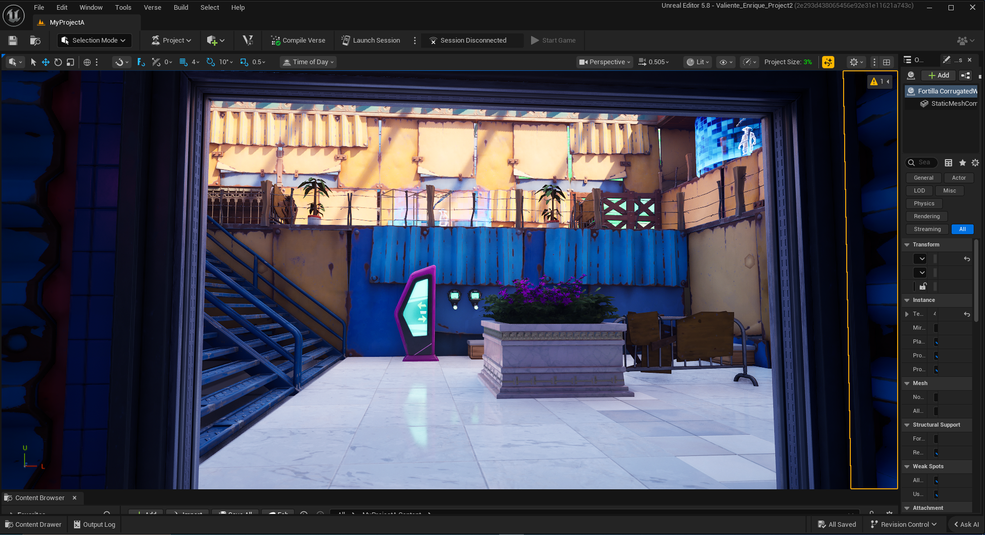
This is the interior of the secret room. It’s meant to be a little hideaway, the player could get a lot of loot from, even a stronger version of one of their weapons.
I also showed that this room existed through a transparent mesh in the fountain combat arena. Due to the nature of how the flow of that level goes, players will usually never see this. I'd probably redesign this area completely to have a different entrance so that players can get to it more easily
Given these areas' pink trees, I tried to show the player's path using blue compost bins. Designating this area as a communal garden of sorts.
This is also where I had to use a lot of fences due to the bush problem mentioned earlier. In hindsight, I'd redesign this area to improve the flow, using the bushes to my advantage rather than squaring them off.
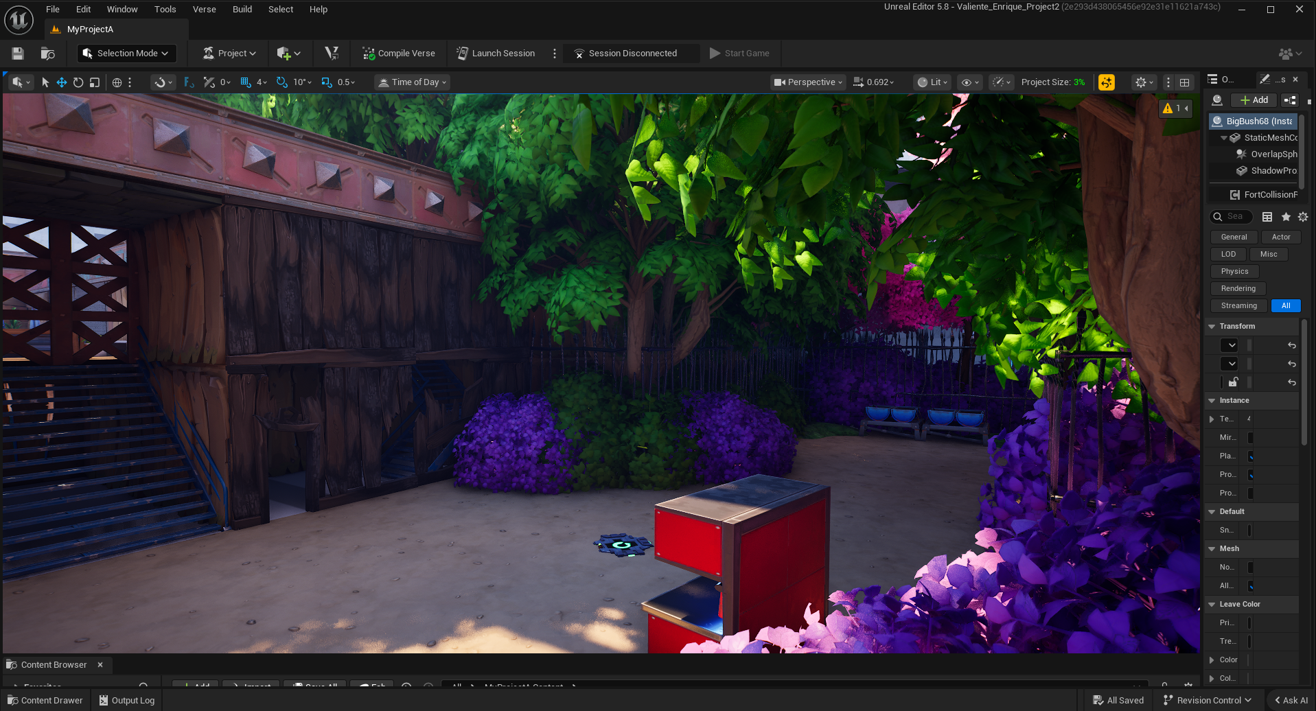
Here is the transition encounter between encounters 3 & 4, this time coming equipped with 2 instances of the shotgun enemy and SMG enemy. This is meant to test the player again on what they’ve already learned.
The compost bins in this area are meant to create a pinch zone, which in turn forces players to go through a form of the door problem. It was interesting to see how they solved this problem, as both offensive and defensive maneuvers were used.
After that encounter the player begins to reach the end of the park, mirroring the entrance they entered from, this is meant to be an intentional choice to provide an internal logic to the park. I was even able to reuse the same visual trick from before!
While it could have been better hidden, there is a secret right behind the square that reveals an extra health pack, which would be useful if the player needed it.
The Fourth Encounter
This shot shows the end of the park area and the beginning of the fort area.
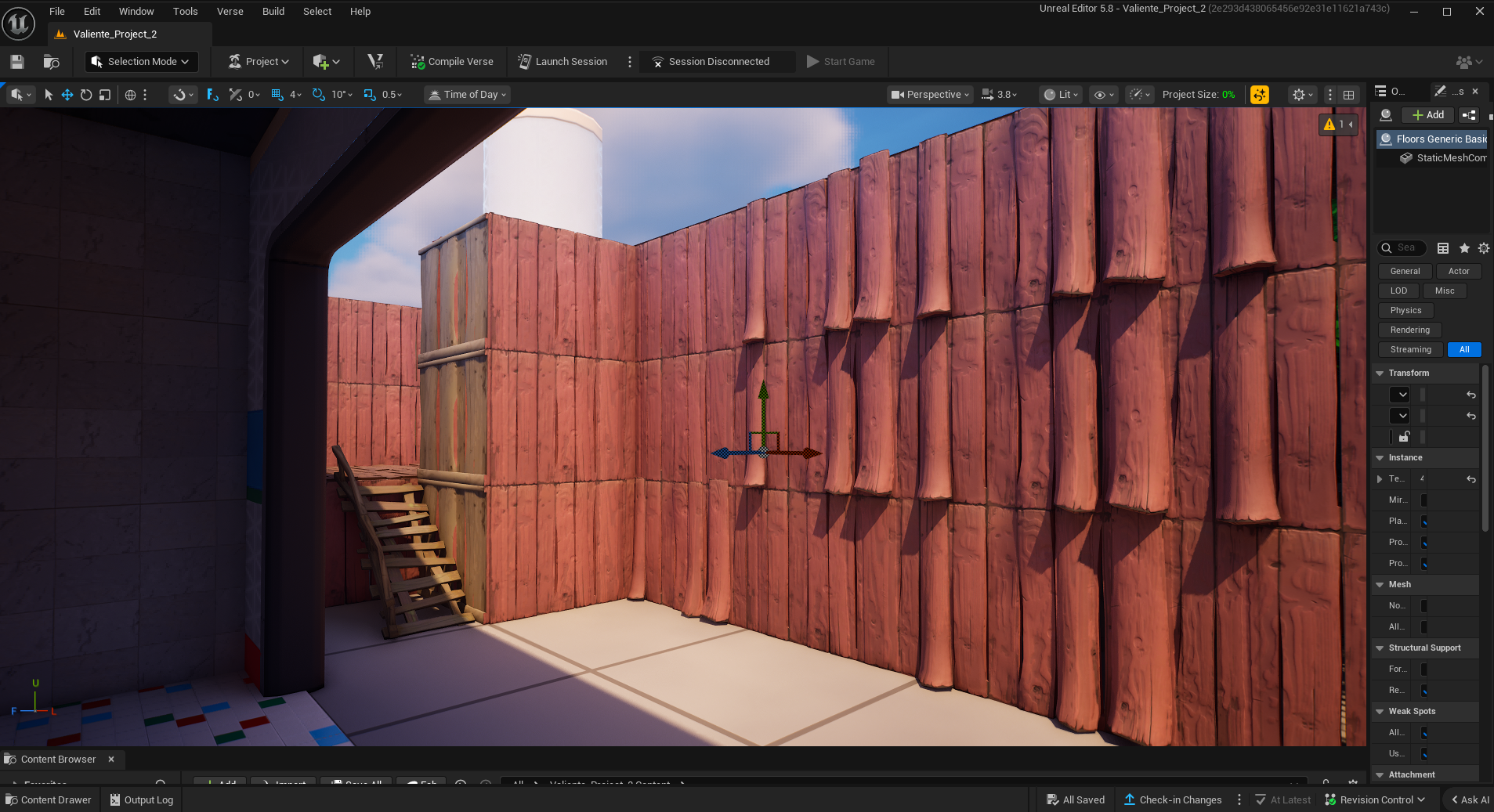
The idea behind the wall material changes is that there is a level of narrative progression as you get closer to the base.
At the start of the level, you enter through one of the weaker areas of the enemy camp. Because of this, it’s made with weaker resources like wood. However, the closer you get to the final section, The more reinforced the camp is, switching to metal at the end.
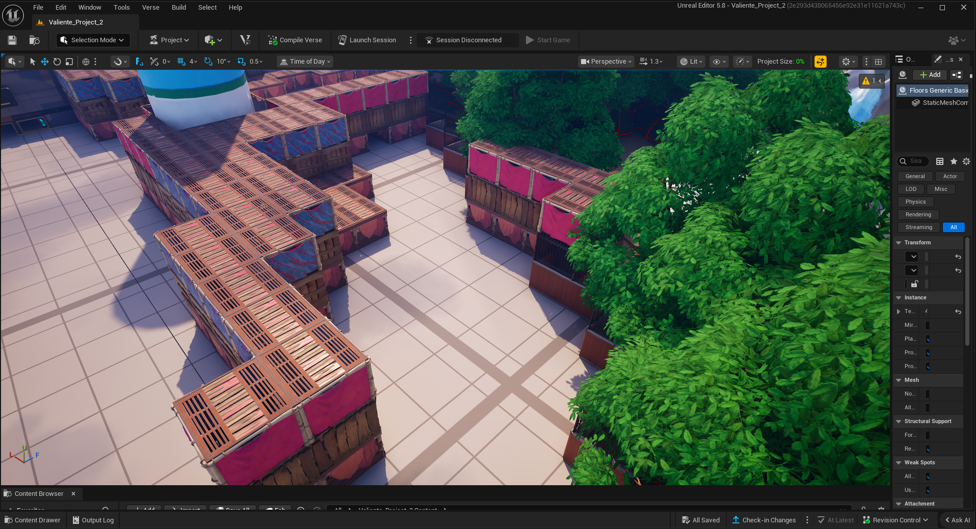
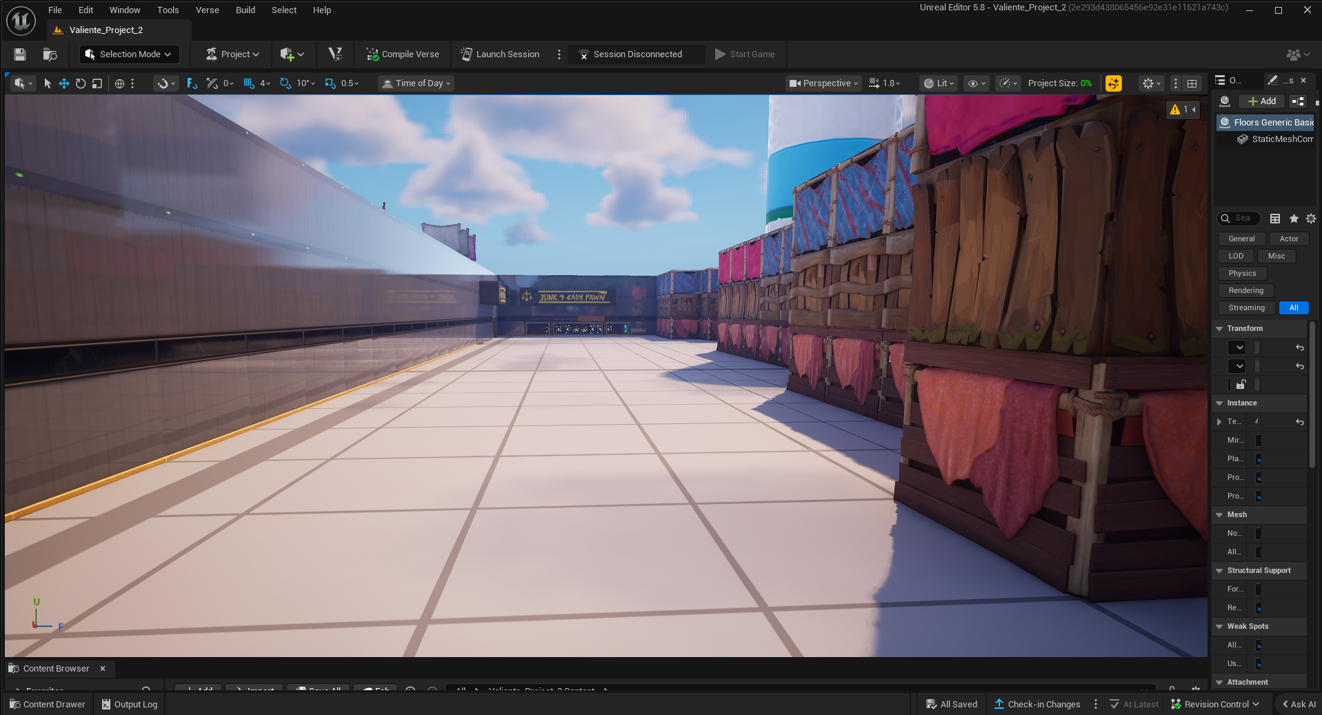
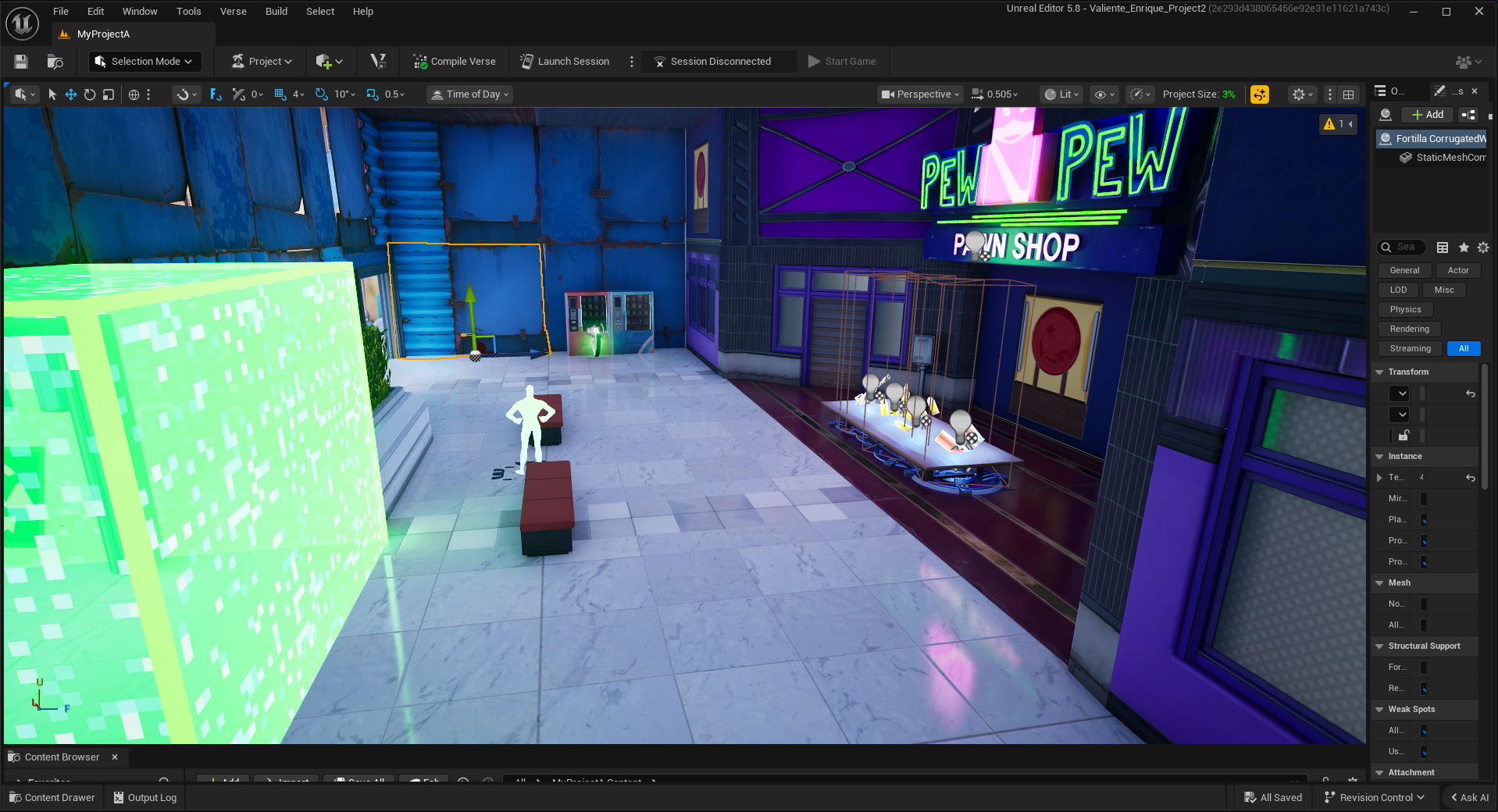
Upon entering the final section of the level, you are greeted with another store, this time a pawn shop that exists right outside the park.
The player's strongest weapon, the assault rifle, is also obtained here. This is meant to keep players on the same level, giving them new weapons after every 2 general enemy encounters.
This door begins Encounter 4, the second-to-last encounter in the game. I personally think this is the weakest encounter in the game due to the level of unfairness I put the player in
Starting with this doorway, the player is immediately peppered with enemy fire, not just from the front, but from the side they cannot see
While the idea was to make the player sweat a little as they neared the end, I think I went too far.
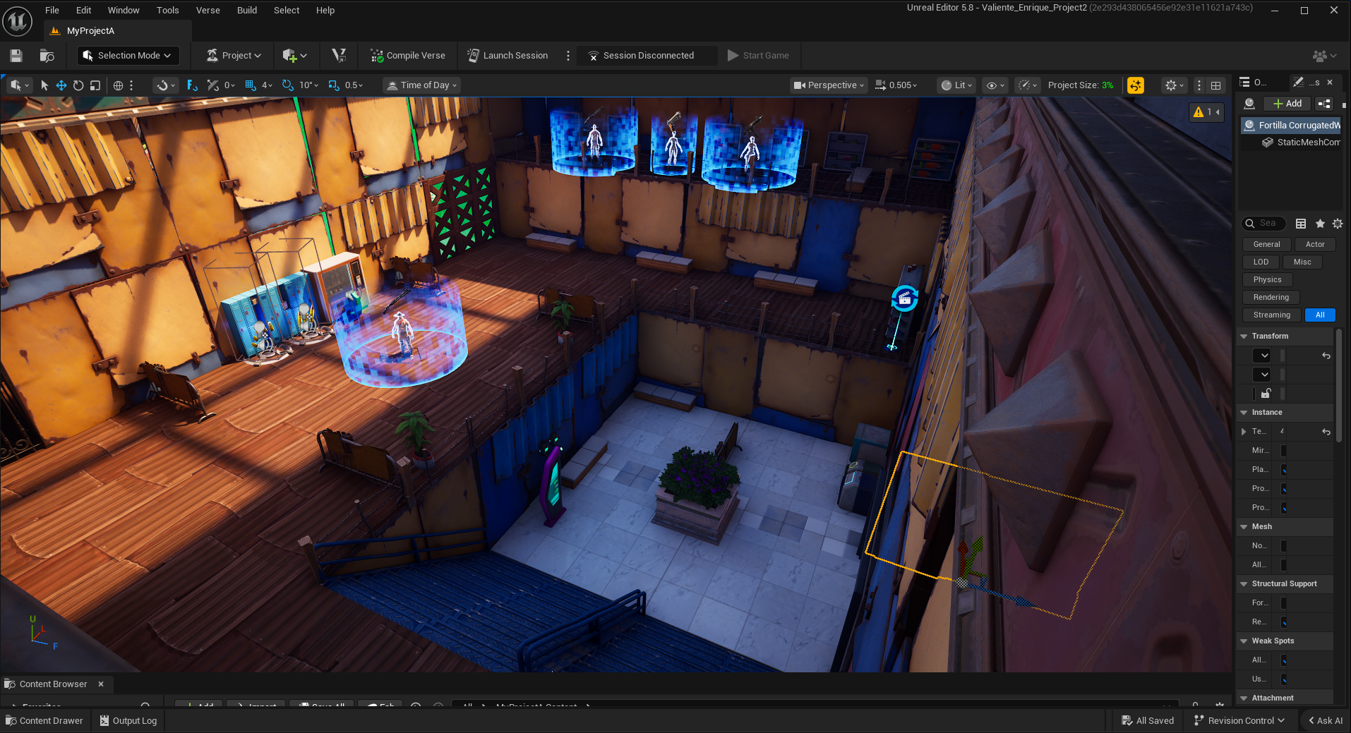
Here is an overhead view of encounter 4. The idea behind this encounter was to train the player to fight enemies that appear above them, which would happen in the next encounter. To balance it I designed the upper level the enemies appear to be a shooting gallery of sorts.
Originally, this map had way more and much stronger enemies; players found the difficulty spike too high. I noticed they struggled the most with the SMG enemies I had placed originally. Due to their high rate of fire, they would get ambushed and die easily. As such, I swapped them for pistol- and shotgun-based enemies, which toned down the damage.
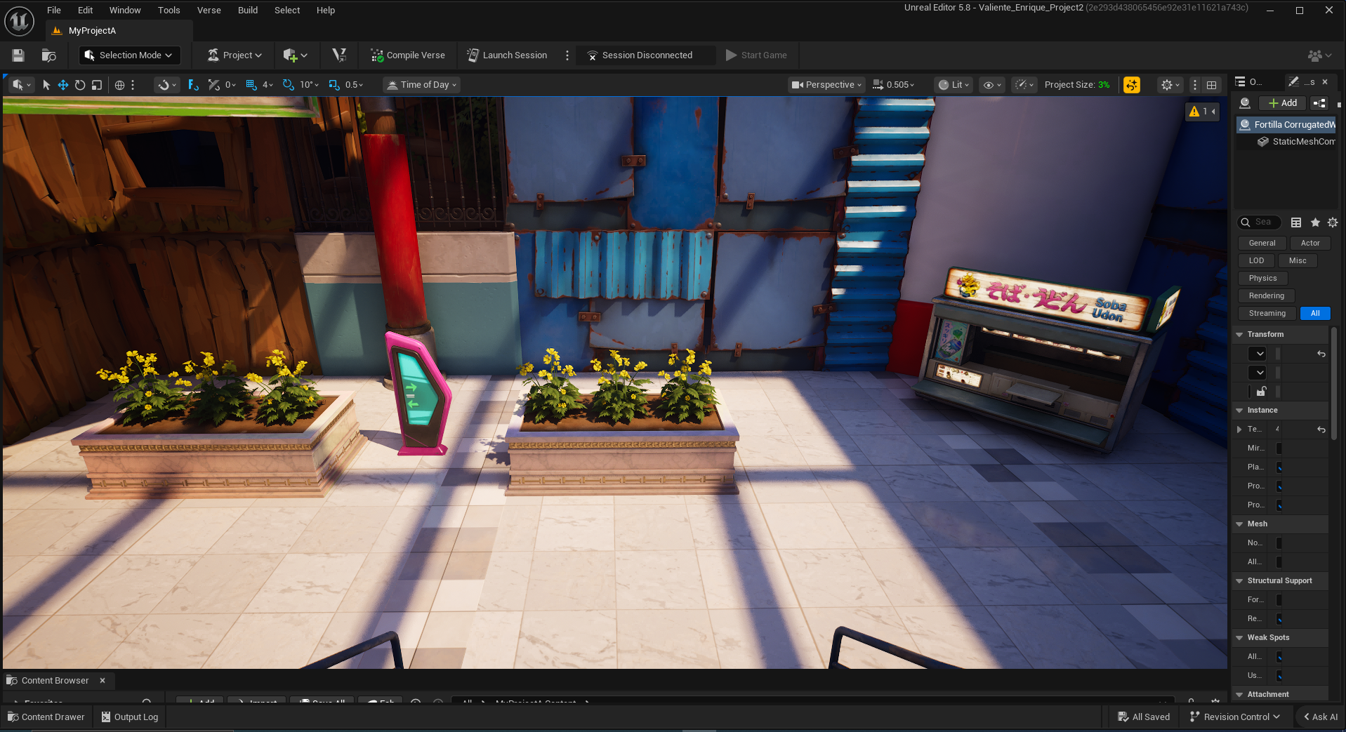
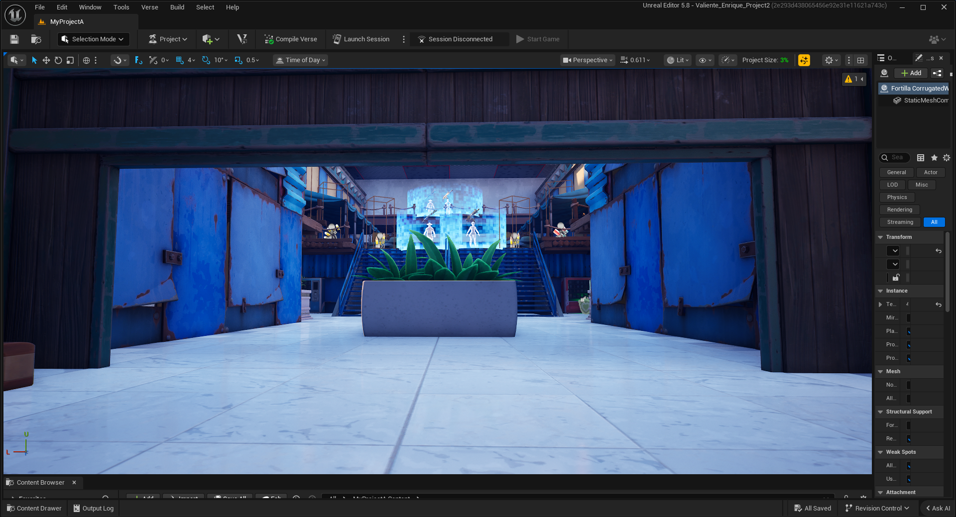
After the fourth encounter, the player will then find themselves at this small rest point.
This show also shows some of the work I put into making this feel like a mall, with potted greenery, mall signs, and the occasional food stand, much like what you see in malls back home.
The Fourth Encounter
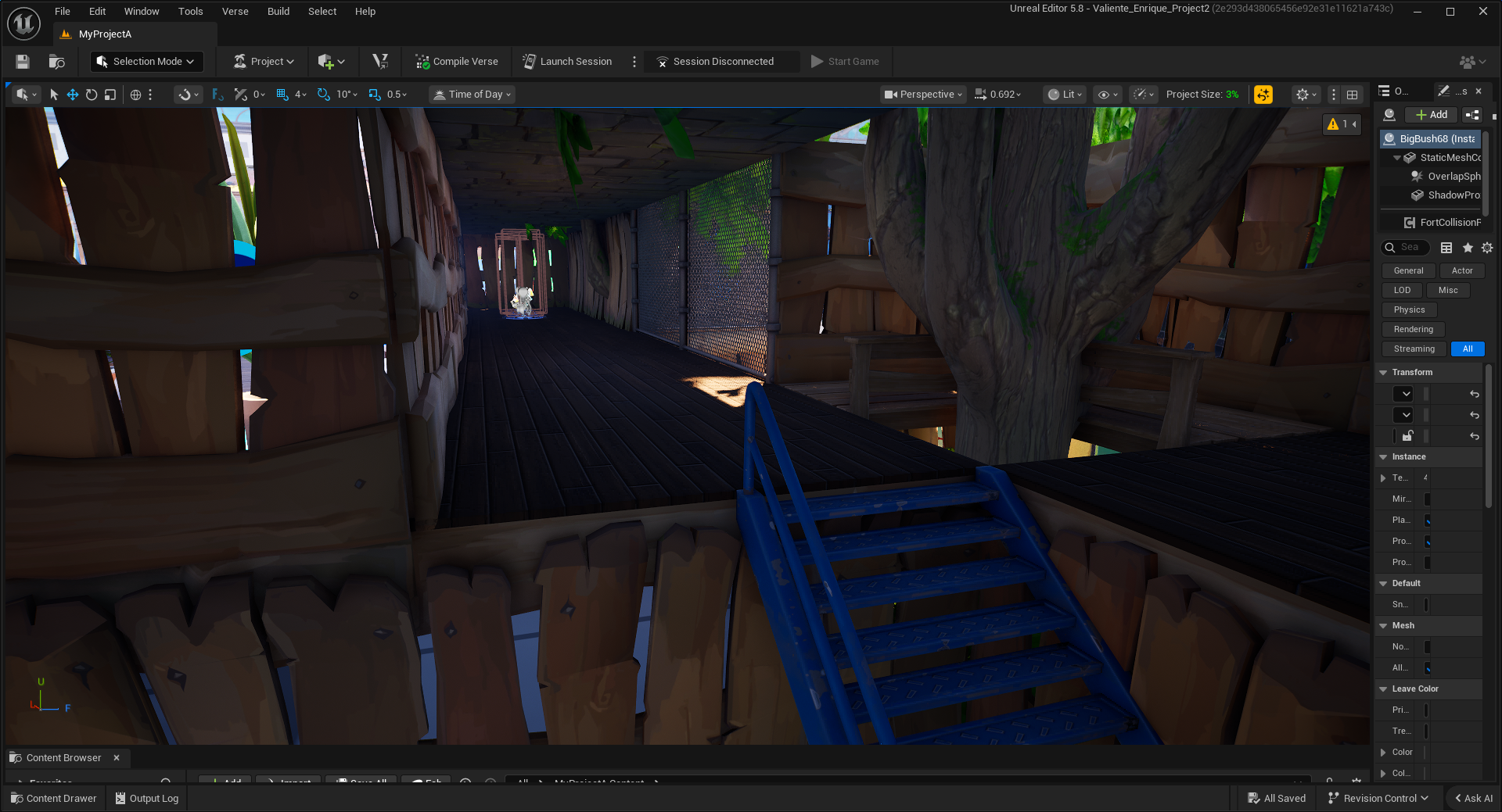
The walk to the final encounter, I think, is frankly weak on a flow and visual level. The main reason is that it is simply two sets of mostly empty hairpin turns, with only one enemy, which is meant to be a tutorial enemy to begin with.
In hindsight, there was a lot of dead space in this area of the level on the development side. I could have taken further advantage of that space and made some more engaging encounters here.After the fourth encounter, the player will then find themselves at this small rest point.
This show also shows some of the work I put into making this feel like a mall, with potted greenery, mall signs, and the occasional food stand, much like what you see in malls back home.
This is meant to be the level's final secret area. designed to be their armory, as such, the player could obtain a bunch of ammo and even a second chance at the weapon from one of the previous secrets
In hindsight, this secret is just too obvious and intricate to be a secret; as such, it feels like it’s part of the main path. Frankly, I think it SHOULD have been part of the main path, with the secret being deeper inside.
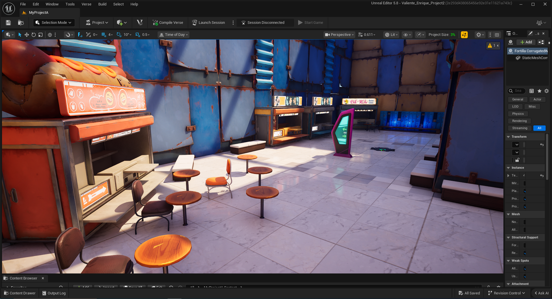
This is the last rest area before the final encounter. I designed it to be almost like a food truck court or an outdoor café-style court.
I snuck in an additional mall sign because I was worried the player wouldn't see the ammo right behind them. Thankfully, most noticed it.
This is the beginning of encounter 5. Encounter 5 plays differently from the rest of the encounters since it plays in waves. The first wave is seen at the top of the stairs.
With the center cover and the ascended enemies, this is meant to be one final test on elevated enemies before pitting the player against the strongest encounter in the game.
Here is an overhead shot of the first half of the 5th encounter. I intentionally hid these health packs and ammo so that the player doesn’t go after them and ruin the siege feeling of this encounter.
However, once they reach the 2nd or third wave, when they do run out of ammo, it’s meant to provide ease of access, a great way to keep the immersion alive without spiking difficulty!
Once the player beats the first wave, they are then struck by two of the strongest enemies in the level, the Assault Rifle enemy, shown to them just before this encounter.
This is meant to be the climax of the level, with the player dodging and firing back at two enemies above them.
The final encounter takes place in this two-floor square arena. The idea being that this is the final stand they have against you. With two assault rifle enemies and two shotgun enemies
This fight is I think one of the most satisfying in the level since not only is it on even ground but also provides a lot of skill expression on how the player wants to approach the situation, with flanking the enemy or charging them head on being examples.
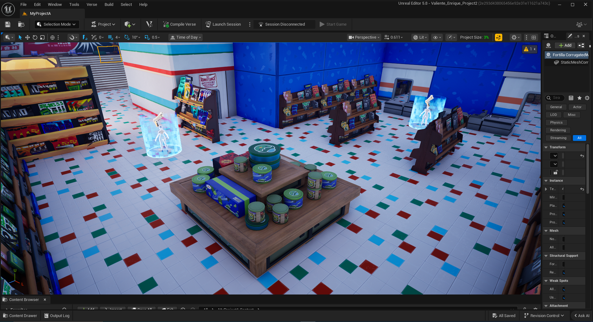
After that final encounter, the player enters the store. I tried to preserve as much of the original layout from the first edition as possible, which players seemed to like.
This is meant to be a complete power fantasy segment. With the player now having defeated the strongest encounter, they are now treated to some weaker enemies they can completely stomp on, however they please.
In order to maximize the use of all the various pieces of cover presented in this section of the level, I decided to pile on a decent number of enemies.
I also tried to reframe aspects of the level design from the previous version that I liked, such as the square and multi-aisle setups.
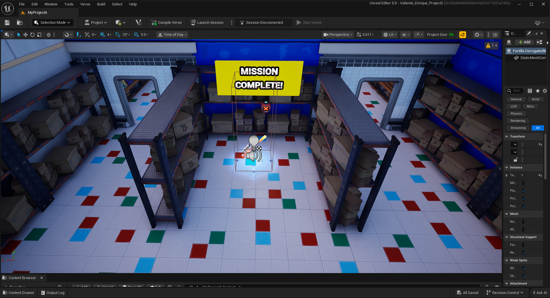
This is the end of the level, having achieved your goal of finding the rare, powerful weapon in the enemy encampment’s arsenal.
This ending is unfortunately abrupt and lame because we ran out of time. If I had more, I would’ve added walkie-talkies across the various rest areas to provide narrative and further context.